Website Maintenance: What You’re Really Paying For
If you’ve ever received a website maintenance invoice and thought, “What did they actually do this month?” — you’re not alone. Website maintenance is one of the most misunderstood costs in the digital world. Most business owners either pay for it without knowing what it covers, or refuse to pay for it and learn the hard way what “it” was.
This guide explains, in plain English, what genuine website maintenance includes, what it usually doesn’t, and how to tell whether you’re getting value for money.
Why websites need maintenance at all
A website is not a finished product the way a brochure is. It’s software — a living system of code, plugins, databases, server configurations and integrations that interact with an internet that changes every single day.
Left alone, a website slowly degrades:
Software ages. WordPress, its plugins and themes release updates constantly — security patches, compatibility fixes, new features. Skip them and the site becomes vulnerable and, eventually, incompatible with itself.
The environment changes. Web browsers update, hosting companies migrate servers, Google changes how it ranks pages. A site that was fine last year can quietly develop problems this year.
Content drifts. Links break, images get removed from their sources, opening hours change, staff move on. A site that isn’t touched starts telling small lies about your business.
Attackers probe. Automated bots scan the internet around the clock looking for outdated software. A business website with a known vulnerability will be found — it’s a matter of when, not if.
Maintenance is the ongoing work that keeps the site healthy, secure, fast and accurate. Think of it like servicing a car: nothing may look broken, but skipping the service is exactly how expensive breakdowns happen.
What genuine website maintenance includes
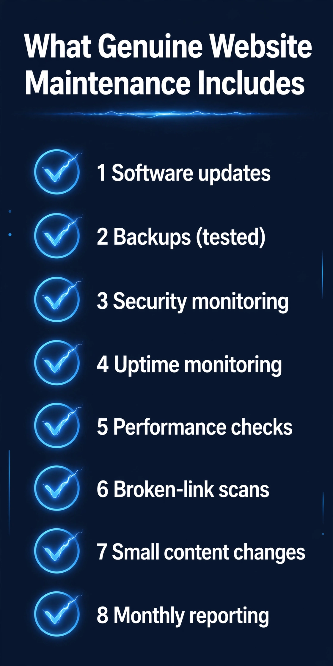
A proper maintenance arrangement should cover most of the following. If your provider’s invoice doesn’t map to at least the first five, it’s worth a conversation.
1. Software updates
The core platform (WordPress, for most small-business sites), themes and plugins all need regular updates. This isn’t clicking “update all” blindly — a good provider tests updates first, because updates occasionally conflict with each other and break layouts or functions. Updating carefully, in the right order, with a backup in place, is the single most important maintenance task.
2. Backups
Your site should be backed up regularly and automatically, with copies stored somewhere separate from your hosting. A backup you can’t actually restore is theatre. Proper maintenance includes periodically testing that backups work, and knowing exactly how the site would be recovered after a hack, a failed update or an accidental deletion.
3. Security monitoring
Maintenance includes keeping an eye on the site: watching for malware, failed login attempts, suspicious file changes and blacklisting warnings. Tools like Wordfence (which we install for our own clients) can automate much of this — but someone still needs to read the alerts and act on them.
4. Uptime monitoring
Your site should be checked automatically, around the clock, so that if it goes down, someone knows within minutes — not when a customer complains. Uptime monitoring is cheap and simple, and it’s one of the easiest things to verify: ask your provider what service they use and what happens when the site goes offline.
5. Performance checks
Sites get slower over time — databases accumulate cruft, image uploads aren’t optimised, new plugins add weight. Maintenance includes periodic checks on loading speed and quick fixes to keep the site running fast, because slow sites lose visitors and rank worse on Google.
6. Broken links and errors
Regular scans for broken internal and external links, missing images and pages that return errors. These accumulate silently and make a site look neglected to both visitors and search engines.
7. Small content changes
Most maintenance plans include a modest allowance of minor updates — changing a phone number, updating opening hours, swapping a team photo, fixing a typo. It’s the “keeping the site truthful” work that businesses need constantly but never have time for.
8. Monthly reporting
You should receive a short, readable report: what was updated, what was fixed, uptime figures, security status. If your provider can’t tell you what they did, that’s a problem — regardless of what the invoice says.
What maintenance usually does NOT include
Just as important is knowing the boundaries. Standard maintenance does not typically include:
A redesign or new design work. Refreshing layouts, adding new sections or changing the brand look is project work, not maintenance.
New functionality. Adding a booking system, an online shop or a members area is development, and it will be quoted separately.
Content creation. Writing new blog posts, producing videos or running your marketing is a separate service.
SEO campaigns. Maintenance keeps the site technically healthy (which supports SEO), but an active campaign to rank higher is its own thing.
Major troubleshooting from neglected updates. If a site hasn’t been touched in two years and an update breaks everything, recovering it is repair work — which is precisely what maintenance is designed to prevent.
None of this is a criticism. But the line should be clear in writing before you sign anything.
Maintenance plans vs pay-as-you-go: which is better?
Both models exist, and both are honest if they’re priced and scoped properly.
A monthly plan spreads the cost. You pay a predictable amount, and the provider handles everything proactively — updates, backups, monitoring, small changes, reports. This is almost always cheaper and calmer than the alternative, because prevention is cheaper than repair.
Pay-as-you-go means you call when something breaks. There are no fixed costs, but when a hack or a failed update takes your site down, you’re paying emergency rates — and losing business in the meantime. This is the equivalent of never servicing your car and then paying for the tow truck.
For a business that depends on its website for enquiries or sales, the plan almost always wins. For a site that’s genuinely dormant, pay-as-you-go may be fine — but be honest with yourself about which category your site is really in.
The DIY question: can’t I just do it myself?
You can, to an extent — and some owners do perfectly well. Updating a small, simple site, taking backups and changing content is learnable. But be realistic about what it actually costs you:
Time. Maintenance is small amounts of work done consistently — exactly the kind of work busy owners keep postponing.
Risk. Updating a plugin that conflicts with your theme at 11pm with no backup is how a site goes down the night before a big launch. Providers update in a safe sequence with a restore plan.
Attention. Security alerts, uptime pings and broken-link reports only help if someone reads them. If that someone is you, in between running your business, they will get skimmed.
The honest maths: if your hour is worth more than the maintenance costs, and the alternative is doing it yourself inconsistently, paying a professional is the better deal.
Red flags: how to spot a bad maintenance deal
A few warning signs worth watching for:
No reports, ever. If you never hear what was done, assume less was done than you think.
“Unlimited everything” for a tiny fee. Maintenance is real labour. Suspiciously cheap plans usually mean updates are automated with no human oversight — fine until the one time it isn’t.
They can’t explain what you pay for. Any provider should be able to tell you, in plain language, what’s included. Jargon soup is a red flag.
No backup strategy. If they can’t tell you where your backups live and how a restore would work, they don’t have one.
Pressure to sign long contracts with no exit. Maintenance is an ongoing relationship. You should be able to leave.
Updates that break the site, repeatedly. Occasional conflicts happen; constant ones mean updates aren’t being tested first.
What good maintenance is worth to your business
Forget the invoice for a moment. What you’re really buying is:
1. A site that doesn’t get hacked — or one that’s recovered in hours, not weeks. 2. A site that’s fast, accurate and always online — the quiet foundation every marketing effort depends on. 3. Time back. Every hour you don’t spend wrestling with updates is an hour running your business. 4. Predictability. One known monthly cost instead of surprise emergency bills.
If your maintenance delivers those four things, it’s doing its job. If it doesn’t, the problem isn’t that maintenance is a waste — it’s that your maintenance is.
How we think about it at Altus
We keep it simple and honest: a firm fixed price once we understand your project, so you know exactly what you’re paying for before anything starts. Our care plans run on a clear Level 1–4 framework — from essential updates and backups through to sites that need proactive monitoring and regular content changes — matched to how much your business actually depends on its website.
No mystery, no jargon, no invoice you can’t understand.
Frequently asked questions
Do I need maintenance if my site is new? Yes — arguably most of all. A new site is at its most vulnerable and its fastest. Maintenance protects the investment you’ve just made.
What happens if I cancel my maintenance plan? You keep your website. Maintenance is a service, not a lease. We’ll hand over everything — logins, documentation, backups — and the site keeps working. It just stops being watched.
Can I switch maintenance providers? Yes, though the new provider will want to audit the site first — they’ll check the platform, the plugins, the hosting and the current state before taking responsibility. That’s a good sign, not a barrier.
Isn’t website maintenance just for big companies? No. Small businesses are targeted by automated attacks just as much as large ones — bots don’t check company size. And small businesses feel the cost of a broken site more, not less.
How do I know if my current maintenance is actually happening? Ask for the monthly report, the backup location, and what was last updated. A good provider answers in minutes. A bad one answers with jargon.
Get a straight answer about your site
If you’re paying for maintenance and not sure what you’re getting — or you’re not maintaining your site at all and want to know the risk — we’ll give you a straight, no-jargon assessment. Book a free 15-minute website audit and we’ll tell you exactly where your site stands.
5 AI Automations That Save Small Businesses Hours Every Week
Every small business owner knows the feeling: the actual work — serving customers, doing the trade, making the product — gets squeezed between admin tasks that eat the day. Answering the same questions, chasing invoices, following up enquiries, asking for reviews, juggling bookings. None of it earns you money directly, but all of it has to be done.
AI automation isn’t about replacing people. For a small business, it’s about getting the repetitive work done in the background so your hours go where they matter. And you don’t need an enterprise budget to start — many of the most effective automations are simple setups that run quietly once configured.
Here are five automations that genuinely save small businesses time every week.
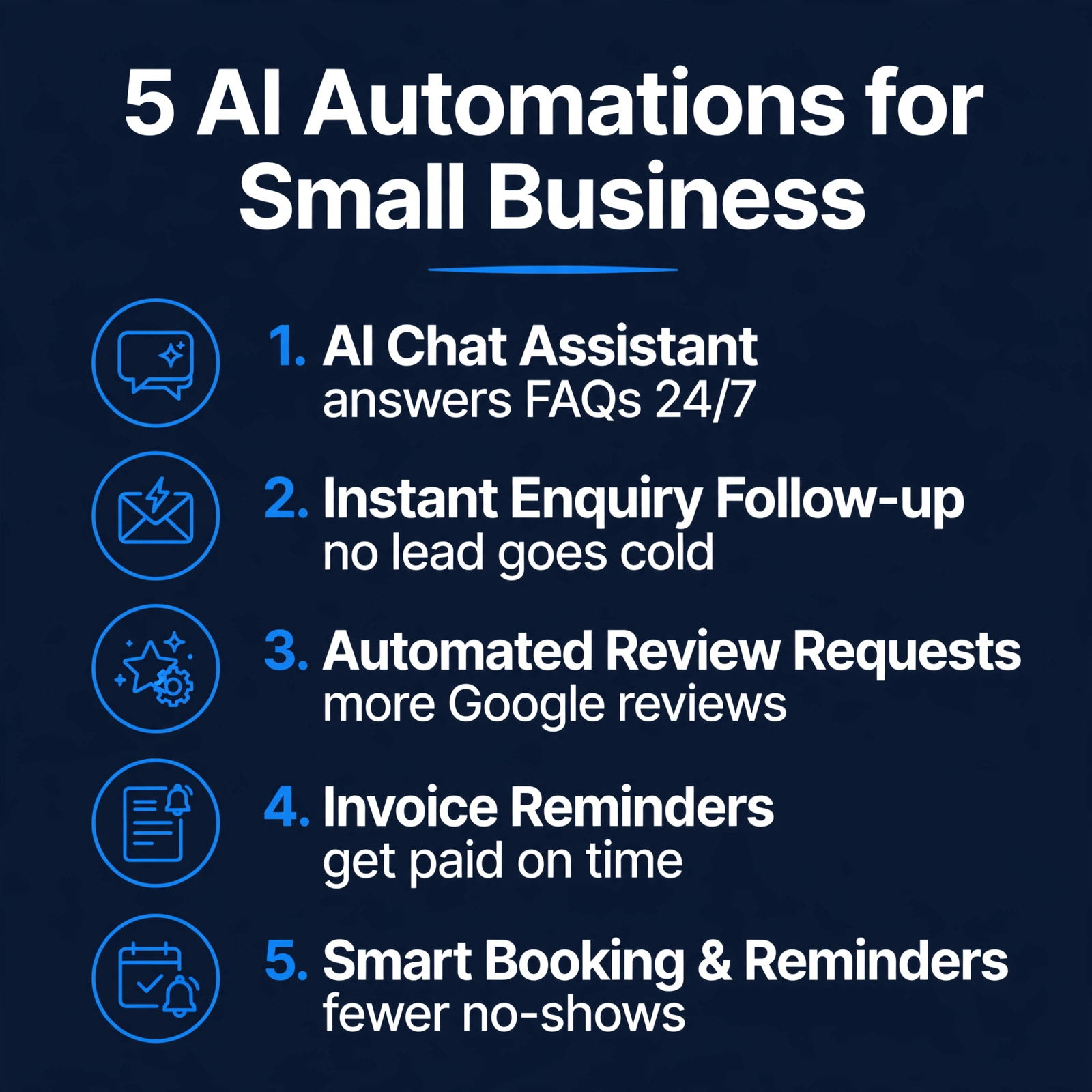
1. An AI Chat Assistant That Answers Questions and Captures Enquiries 24/7
The questions customers ask are remarkably repetitive: opening hours, prices, whether you cover their area, how to book. An AI chat assistant on your website answers these instantly — including at 10pm on a Sunday when you’re not checking your phone.
The point isn’t to replace human conversation. It’s to make sure a visitor with a simple question gets an answer immediately instead of bouncing to a competitor, and that a visitor with a real enquiry leaves their details for you to follow up in the morning.
A good setup escalates: routine questions get answered, anything complex or high-value gets passed to you with the context captured.
2. Instant Enquiry Follow-Up — So No Lead Goes Cold
Enquiries that sit unanswered lose their urgency fast. A potential customer who fills in your contact form on Friday evening and hears nothing until Monday has had the whole weekend to find someone else.
An automated follow-up sends an instant acknowledgement — “Thanks, we’ve got your message, we’ll reply by [time]” — and can create a task or calendar reminder so the enquiry is chased properly. It buys you time without making the customer wait.
This one automation protects the value of every other marketing effort you make. There’s no point paying for traffic or SEO if enquiries die in an inbox.
3. Automated Review Requests After Every Job
Reviews are gold for local businesses — they influence Google rankings and customer trust — but almost nobody asks for them consistently. You’re busy finishing the job; asking for a review slips your mind; a month later the customer has forgotten the details.
Automation fixes the follow-through: when a job is marked complete (or a few days after an invoice is paid), the customer automatically gets a polite message with a direct link to your Google review page. You set it up once; reviews accumulate steadily.
One caution: never automate fake reviews or incentivise them in ways that break Google’s rules. Ask honestly, make it easy, and let genuine customers speak.
4. Invoice Reminders That Chase Payment Politely
Late payments are a cash-flow killer for small businesses — and chasing them is awkward, time-consuming work that owners put off. Automated invoice reminders take the emotion out of it: a friendly nudge a few days before the due date, another shortly after, escalating in firmness, all sent automatically.
Pair this with clear payment terms on every invoice (what’s due, when, and what happens if it’s late), and most late payers pay up after the first or second automated reminder — no awkward phone calls needed.
This is one of the highest-ROI automations there is: it costs almost nothing to run and directly improves the money coming in.
5. Smart Booking and Appointment Reminders
If your business runs on appointments — consultations, call-outs, lessons, treatments — missed appointments are pure lost income. Automated booking lets customers choose a slot themselves (even outside your working hours), and automated reminders the day before cut no-shows dramatically.
The best setups also handle rescheduling: instead of a phone tag exchange, the customer clicks a link and picks a new time. Your calendar stays full with a fraction of the admin.
How to Start Without Getting Overwhelmed
Five automations at once is too much. Start with the one that hurts most:
Pick your biggest time-drain. If enquiries go unanswered, start with the chat assistant or instant follow-up. If cash flow is the pain, start with invoice reminders.
Start simple, then refine. A basic version running this week beats a perfect version planned for next quarter. You can improve the wording and logic once it’s live.
Keep a human in the loop. Automation handles the routine; you handle the exceptions. The goal is fewer repetitive tasks, not zero oversight.
Measure what changed. Are you answering enquiries faster? Getting more reviews? Fewer no-shows? If an automation isn’t earning its keep, switch it off and try the next one.
One more honest note: automation works best on top of solid foundations. An AI chat assistant can’t fix a website that confuses visitors, and automated follow-up can’t save enquiries your site never captures. Get the basics right first — then automate.
Frequently Asked Questions
Is AI automation expensive for a small business?
Not necessarily. Many automations use tools you may already pay for, or affordable dedicated services. The real cost is the setup time — getting the wording, timing and logic right. Once running, most cost very little month to month.
Will automation make my business feel impersonal?
Only if it’s done badly. Good automation is invisible: the customer gets a faster answer, a smoother booking, a polite reminder. It feels like good service, because it is good service. Keep the tone human and always offer a way to reach a real person.
Do I need technical skills to set these up?
For basic versions, no — many tools are designed for non-technical users. For anything touching your website’s code or connecting multiple systems, it’s worth getting help so it’s done properly the first time.
Which automation should I start with?
The one tied to your biggest pain: lost enquiries (chat assistant + instant follow-up), cash flow (invoice reminders), reputation (review requests), or diary chaos (smart booking). Start with one, get it working, then add the next.
Can automation replace my receptionist or admin staff?
It replaces repetitive tasks, not people. Your staff spend less time on routine admin and more on the work that actually needs a human — the judgement calls, the relationships, the tricky problems.
Reclaim Your Week
None of these automations is magic. They’re just the repetitive parts of running a business, handled consistently, without you having to remember them. Add them up and the hours come back — hours you can spend on customers, on growth, or simply on finishing the day on time.
If you’d like help figuring out which automation fits your business first — or whether your website is ready to support them — book a free 15-minute website audit. We’ll look at how enquiries, bookings and follow-ups work on your site today and give you a straight answer on what to automate first, and what it would cost as a firm fixed price.
Open ten browser tabs and try to find the site you want. You won’t read the titles — you’ll scan the little icons. That 16-pixel square is the favicon, and it’s doing more work for your brand than almost anything else that small on the internet. And yet an astonishing number of business websites don’t have one. They show the browser’s default blank-page icon instead — the little grey document that quietly tells every visitor the site isn’t quite finished. Here’s what a favicon actually is, why it matters, and how to get yours sorted in about five minutes.
What a favicon actually is
A favicon (short for “favourite icon”) is the small image browsers show in the tab next to your page title. The classic format is favicon.ico, a special file dating back to Internet Explorer that can hold several sizes inside one file — 16, 32 and 48 pixels. Modern browsers also accept plain PNGs. It appears in more places than the tab: bookmarks and bookmark bars, browser history, shortcut icons, and the home screen when someone saves your site on their phone. One tiny image, many jobs.
Why it matters more than its size suggests
Nobody ever chose a supplier because of a favicon. But it works at the level of first impressions and findability:
People scan tabs, not titles
With a dozen tabs open, titles are truncated to a few characters. The icon is the recognisable bit. No icon, no recognition — your tab is just another grey rectangle.
The blank icon says “unfinished”
Visitors can’t always articulate it, but a site with the default browser icon feels less cared-for than one with a proper mark. It’s the digital equivalent of an unpainted front door.
Bookmarks and home screens
A bookmarked site with a real icon is easier to spot and revisit. On phones, the icon you supply becomes the app-like tile on the home screen. Without it, you get a generic screenshot thumbnail.
The sizes you actually need
Here’s the honest, complete set — the reason “just upload a PNG” advice falls short:
favicon.ico (16, 32, 48 pixels in one file)
Still the safest default. Browsers have requested /favicon.ico automatically for decades, and the multi-size format means the browser picks the sharpest size for the context.
PNGs at 16, 32 and 48 pixels
What modern browsers actually prefer when you point them at files with link tags. Crisp at each size, no scaling guesswork.
Apple touch icon (180×180)
What iPhones and iPads use when someone saves your site to their home screen. One honest warning: iOS ignores transparency and fills it with black — a transparent logo becomes a black square. Give it a background colour.
Android icons (192×192 and 512×512) plus a manifest
What Chrome on Android uses, described in a small manifest.webmanifest file. Needed if you want your site to look right when installed as an app-like shortcut.
Five favicon mistakes we see everywhere
No favicon at all. The most common. Two minutes now beats looking unfinished forever.
One stretched 16-pixel image. A single tiny file scaled up looks blurry everywhere else. Each size should be rendered properly.
A transparent logo on iPhone. As above: transparency becomes black on iOS home screens. White or a brand colour background fixes it.
A detailed logo at 16 pixels. Fine print and thin lines vanish. A simplified mark — one letter, one shape — reads far better.
Never testing it. Favicons cache aggressively. After installing, hard-refresh or open a new tab before deciding it “didn’t work”.
Make yours in 5 minutes (4 steps)
Doing all of the above by hand means graphics software, an ICO converter and a snippet written from memory. Our free Favicon Generator does it in one pass:
Step 1 — Upload your logo
Drag in a PNG or JPG, ideally 512×512 or larger. Nothing is uploaded anywhere — it all happens in your browser.
Step 2 — Style it
Pick a background (transparent, white, dark navy or Altus blue) and padding. If your image isn’t square or is too small, the tool warns you now — not after you’ve installed a blurry icon.
Step 3 — Check the live preview
See every size rendered, plus a mock browser tab showing your icon at a real 16 pixels. What you see is what every visitor gets.
Step 4 — Download and install
Grab each file individually or everything as one zip (manifest and snippet included), then copy the head snippet. Upload the files to your website’s main folder, paste the snippet, reload.
The files go in your website’s root folder — the same folder your homepage lives in. The snippet goes inside the head section of your pages, before the closing head tag. On WordPress, you can also set the 512-pixel icon under Appearance → Customise → Site Identity, but the full file set plus the snippet is what covers every browser and device. After installing, don’t panic if the old blank icon lingers: browsers cache favicons hard. A hard refresh (Ctrl/Cmd + Shift + R) or a fresh tab usually reveals the new one.
FAQs
Do I really need a favicon if my site just launched?
Yes — especially then. It’s a two-minute job that removes one more “unfinished” signal. Do it on day one and never think about it again.
Can I just use my full logo?
If it’s readable at 16 pixels, yes. Most full logos aren’t — text becomes smudge. A simplified version (initial letter, icon mark) almost always works better at favicon sizes.
Why isn’t my favicon showing after I uploaded it?
Almost always caching. Browsers hold onto the old (or missing) icon aggressively. Hard-refresh, try a private window, and give it a few minutes.
Is the .ico format still needed?
For the widest compatibility, yes. Browsers still request /favicon.ico by default, and the multi-size format covers old and new contexts in one file. It’s cheap insurance alongside the PNGs.
The favicon is the smallest brand asset you’ll ever make and one of the most-seen. Five minutes, one upload, every size done — that’s the whole job.
Want the rest of your website brought up to the same standard? Book a free 15-minute consultation — we’ll review your site and tell you exactly what needs fixing, in plain English.
Every business owner loves a bargain. And when someone offers you a full website for a fraction of what agencies charge, it’s tempting — why pay more for the same thing?
Here’s the uncomfortable truth: it’s rarely the same thing. A cheap website almost always costs more than a properly built one — you just pay the difference later, in ways that don’t show up on the original quote. Lost customers, security problems, rebuilds, and months of frustration: that’s the real price tag.
This guide breaks down exactly where cheap websites bleed money, so you can spot a bargain that isn’t one.
The Price on the Quote Isn’t the Price You Pay
Think of a website like a car. One dealer offers you a car for a quarter of the going rate. It looks fine in the showroom. But the engine is second-hand, the brakes are worn, and there’s no warranty. Six months later you’re paying for repairs that cost more than the car did — and the whole time, it keeps breaking down on the motorway.
Cheap websites work the same way. The quote covers the bare minimum: a template filled in with your text, launched quickly, with little thought about how it performs, how secure it is, or whether it actually brings you customers. Everything the builder skips to keep the price down becomes your problem later.
The real question isn’t “how much does the website cost?” It’s “how much will this website cost me over the next two years?” — in money, in lost business, and in your own time.
Where Cheap Websites Bleed Money
Lost customers you never hear from
This is the biggest hidden cost, and the hardest to see. A visitor lands on your site, something puts them off — slow loading, a layout that breaks on their phone, copy that doesn’t answer their question — and they leave. They don’t complain. They don’t email you. They just go to a competitor.
You never see these losses in your accounts. But a website that fails to turn visitors into enquiries is like a shop assistant who ignores every customer who walks in. Over a year, even a small drip of lost enquiries adds up to serious money — far more than the difference between a cheap build and a proper one.
Cheap builds cut corners exactly where conversions happen: clear calls to action, fast loading, mobile-friendly layouts, and copy that speaks to what the customer actually wants.
Security disasters
Properly built websites get regular updates, security hardening, and backups. Cheap websites often don’t. Outdated software, weak passwords left by the builder, and no backup routine are invitations to hackers.
A hacked website can mean:
Your site taken offline for days or weeks while it’s cleaned up
Google blacklisting your site with a “this site may be hacked” warning
Customer data compromised, with all the trust and legal fallout that brings
Emergency clean-up bills from a developer who has to untangle someone else’s mess — at emergency rates
Prevention is always cheaper than the cure. A site built with security in mind from day one costs a fraction of what a single serious breach costs in lost business and repair bills.
SEO damage that takes months to undo
Google notices quality. Sites that load slowly, aren’t mobile-friendly, have thin or duplicated content, or are riddled with technical errors rank poorly — and a cheap build usually ticks several of those boxes.
Worse, some bargain builders actively harm your SEO: copied template text duplicated across dozens of client sites, keyword-stuffed nonsense copy, or “SEO included” that means nothing more than a plugin installed and left on default settings.
The result is a site that sits on page five while competitors take the enquiries. Fixing it later means an SEO overhaul on top of the rebuild — paying twice for what should have been done once.
The rebuild nobody warns you about
This is the most common ending for a cheap website. Within a year or two, the site can’t do what the business needs. Adding a booking system, a shop, or new service pages is either impossible on the cut-down setup or breaks something else. The builder has vanished, or charges extra for every tiny change.
So you start over. You pay a proper developer to rebuild the site — often having to work around or untangle the old one first, which costs more than starting from scratch would have. The “cheap” website plus the rebuild costs more than the decent website would have cost in the first place.
We’ve seen this pattern so often it has a shape: Level 4 (full rebuild from scratch) when a Level 1 or Level 2 project would have been enough the first time — if it had been built properly.
Your time, drip by drip
Cheap websites are rarely easy to run. Editing text breaks the layout. Adding a page requires calling the builder (who takes a week to reply). The admin area is a maze of unfamiliar plugins. Every small task eats an hour of your day or a favour from someone technical.
Your time has a value. A website you can’t update yourself without fear is a website that costs you attention every single week — attention that should be going into running your business.
The “Fine Print” of Cheap Website Deals
Not every cheap quote is dishonest — but many hide costs in the details. Before you sign anything, check for these:
Ongoing fees you didn’t agree to. Some builders charge monthly “maintenance” that amounts to doing nothing, or lock essential features behind paid add-ons.
You don’t own your website. Some deals mean the builder owns the design, the domain, or even the content. Try to leave, and you discover you’re renting, not owning. Always make sure the domain is registered in your name and you have full admin access.
No support after launch. The site goes live, the builder disappears, and the first time something breaks you’re on your own.
Template lock-in. Your site is built on a proprietary builder or a heavily customised template that only that builder understands. Switching developers means starting over.
Content that’s yours in name only. Stock photos you don’t have licences for, copied text, or a logo “thrown in” that turns out to be someone else’s design — all liabilities waiting to surface.
None of this appears on the quote. All of it appears on your bill eventually.
What a Properly Built Website Actually Gives You
None of this means you should overpay. It means you should pay for the right things. A properly built website — priced honestly — gives you:
A site that converts. Clear structure, fast loading, mobile-first design, and copy written to answer your customers’ questions. Every visitor has a reason to stay and a clear next step.
Security as standard. Updated software, proper backups, hardened logins — the boring stuff that means you never think about it.
SEO foundations. Clean code, sensible structure, proper titles and descriptions, fast pages. Not magic rankings overnight — but a site Google has no reason to penalise.
Room to grow. Built on a standard platform you (or any developer) can extend. When the business adds services, the site grows with it instead of holding it back.
Ownership. Your domain, your content, full admin access, no lock-in. It’s your asset, not someone else’s rental income.
A fixed price you can trust. You’ll always get a firm fixed price once we understand your project — no hourly billing surprises, no scope creep, no mystery extras.
At Altus Web Solutions, projects fall into four levels — Level 1 (quick refresh and small fixes), Level 2 (redesign of key pages), Level 3 (full redesign keeping your content), and Level 4 (full rebuild from scratch). Most businesses need less than they fear. We’ll tell you honestly which level fits — even if the answer is “you don’t need to spend money on this yet.”
How to Spot a Quote That’s Too Cheap to Be True
Use this checklist before you commit to any web project, cheap or not:
Ask what’s included. A proper quote lists pages, features, content, SEO setup, and support. A vague quote hides vague work.
Ask who owns what. Domain, design, content, admin access — get it in writing that it’s all yours.
Ask about ongoing costs. Hosting, maintenance, licences — know the full yearly cost, not just the build price.
Ask how you’ll update it. If you can’t add a page or change text without the builder, you’re buying dependence, not a website.
Ask about security and backups. If the answer is a blank stare, walk away.
Check their own website. A web company with a slow, broken, or outdated site is telling you everything you need to know.
Be wary of pressure. “This price is only available today” is a sales tactic, not a bargain.
A fair price for a good website isn’t the lowest number you can find. It’s the number attached to a quote that answers all seven questions properly.
Frequently Asked Questions
Is a cheap website ever okay?
Sometimes — for a genuine short-term need, like a single landing page for an event. But for your main business website, which has to win customers for years, cheap is almost always the most expensive option.
How do I know if my current cheap website is costing me money?
Look for the symptoms: few enquiries relative to your traffic, complaints about the site, anything broken on mobile, no updates or backups happening, and dread every time you need to change something. A free audit will tell you for certain.
Can’t I just start cheap and upgrade later?
You can, but “upgrading” a badly built site usually means rebuilding it. The cheap build becomes sunk cost. It’s almost always cheaper to build it right once.
What should a small business website actually cost?
It depends on your goals, pages, features, and integrations — which is exactly why we give a firm fixed price once we understand your project, rather than guessing. What we can promise: no hourly billing, no surprise extras, and an honest recommendation about which of our four project levels you actually need.
I already have a cheap website that’s causing problems. What now?
Don’t panic, and don’t keep patching it indefinitely. Get an honest assessment of whether it can be saved with a refresh or needs a rebuild — then make the decision once, properly.
Stop Paying Twice for Your Website
The cheapest website is the one you only pay for once. If your current site is costing you customers, sleep, or sanity — or if you’re about to commission a new one and want to get it right first time — let’s talk.
Book a free 15-minute website audit and we’ll look at your site, show you exactly where it’s costing you money, and give you a straight answer on what it needs — and what it would cost as a firm fixed price.
Mobile-First Design: Why Your Visitors Decide in Seconds
Imagine a customer standing in their kitchen, phone in one hand, searching for a service like yours. They tap your website. The text is tiny. The menu won’t open properly. The phone number isn’t clickable. Seconds later, they’ve hit the back button — and they’re on your competitor’s site, which loads cleanly and shows a big “Call now” button.
That moment plays out thousands of times a day for small businesses across the UK. It has nothing to do with your prices, your reviews, or the quality of your work. It’s about one thing: your website wasn’t designed for the phone in their hand.
Most business owners still think of their website as something people look at on a computer. That’s backwards now. For most small businesses — trades, salons, cafés, clinics, local services — the phone is the first and often the only screen a customer ever uses. If your site doesn’t work brilliantly on mobile, it doesn’t matter how good it looks on a desktop.
This is exactly what mobile-first design is about — and why it matters more than almost any other decision you’ll make about your website.
What “Mobile-First” Actually Means
For years, websites were designed for desktop computers first. Designers built a big, wide layout, filled it with content, and then “squished” it down to fit a phone screen at the end. The mobile version was an afterthought — a shrunken copy of the real site.
Mobile-first flips that around. You start by designing for the smallest screen, and then scale up for larger ones. It sounds like a subtle difference, but it changes everything.
When you design for a phone first, you have almost no room for clutter. Every headline has to earn its place. Every button has to matter. The contact number has to be tappable. There’s nowhere to hide weak thinking — the small screen exposes it.
Then, when you scale up to tablets and desktops, you add breathing room and richer layouts — not as compensation for a broken mobile site, but as an enhancement of a solid one.
Why the Phone Is Where Your Visitors Decide
Decisions happen in moments, not sessions
People browse on their phones in spare moments — on the train, in a queue, during a lunch break, or on the sofa in the evening. They’re not settling in for a long read. They’re asking one quick question: “Is this the business for me?”
If your site answers that question fast — clear headline, obvious services, easy contact — you win the enquiry. If it makes them pinch, zoom, hunt for a menu, or wait, they move on. Not because they’re rude, but because there are plenty of competitors one tap away.
The small screen reveals everything
Desktop sites hide a lot of sins. A confusing navigation can look fine when a dozen menu items are spread across a wide bar. On a phone, those same items become a tangled mess behind a menu icon.
Weak copy hides on desktop too. A long paragraph that looks “informative” on a big screen looks like a wall of text on a phone that nobody will read. Mobile-first forces you to write tight, clear copy — which, funnily enough, works better on desktop as well.
The Three-Second Test
Forget complicated analytics for a moment. Open your website on your phone and answer these questions honestly:
Can you tell what the business does without scrolling?
Is the phone number or enquiry button visible and tappable immediately?
Does the page feel fast, or are you staring at a loading screen?
Can you read everything without pinching to zoom?
Would you trust this business based on the first screen alone?
If the answer to any of those is “no”, you’re losing visitors you never hear from. They don’t complain — they just leave.
What Mobile-First Design Looks Like in Practice
Start small, then scale up
A proper mobile-first build begins with the phone layout: one column, clear hierarchy, one obvious action per screen. Once that works, the design adapts upward — the tablet gets a bit more width and imagery, the desktop gets the full, roomy layout. Same content, same brand, a better experience at every size.
Big, thumb-friendly touch targets
On a desktop you have a precise mouse cursor. On a phone you have a thumb. Buttons and links need to be large enough to tap comfortably, with enough space around them that you don’t hit the wrong one. This sounds obvious, yet it’s one of the most common failures on older business websites — tiny text links crammed together that were clearly designed for a mouse.
Speed is part of the design
A mobile visitor is often on a patchy connection — a train, a car park, a rural high street. If your page takes ages to load, it doesn’t matter how beautiful it is; they’ll never see it. Mobile-first design means choosing fast-loading images, lean code, and no heavy gimmicks that look impressive on a fast office connection and crawl everywhere else.
Content that respects a small screen
Short paragraphs. Clear headings that let people scan. One idea per section. Contact details that are always one tap away — a sticky call button, a click-to-call number, a short enquiry form with as few fields as possible. Everything a visitor needs, and nothing they don’t.
The Mistakes That Cost You Mobile Visitors
We see the same mobile mistakes on small-business websites again and again:
1. The shrunken desktop. The whole desktop layout compressed onto a phone. Text the size of a grain of rice. Visitors leave instantly.
2. Menus that fight back. Dropdown menus that won’t open on touch, or navigation with so many items it needs its own search function.
3. Forms built for keyboards. Ten-field contact forms with tiny input boxes that are torture to fill in on a phone. Every extra field costs you enquiries.
4. Pop-ups that trap people. A full-screen pop-up with a close button the size of a full stop. On mobile, that’s a rage-quit.
5. Unclickable contact details. A phone number written as plain text instead of a tap-to-call link. A visitor who has to memorise your number and switch apps to dial it probably won’t bother.
6. Images that take forever. Massive, uncompressed photos that look great on a monitor and take an age to load on a mobile connection.
If your site has two or three of these, it’s not a disaster — but it is a leak. And leaks are expensive, because every lost visitor is an enquiry that went to someone else.
What Mobile-First Means for Your Project
Here’s the honest part: designing mobile-first takes more thought, not less. It requires the designer to make hard decisions about what matters most on every page. Templates and page builders often get this wrong, because they let you design a pretty desktop layout and auto-generate a mediocre phone version as an afterthought.
When we build a website, mobile-first thinking is baked into every project level — from a simple starter site to a full custom build. We design for the phone in your customer’s hand first, then scale up. It’s simply how we work, because it’s how your customers actually browse.
And because every business is different — different pages, different features, different goals — we quote a firm fixed price once we understand your project. No hourly billing, no surprise extras: just an honest recommendation about which of our four project levels fits what you need.
FAQ
What is mobile-first web design?
It’s an approach where the website is designed for mobile phones first, then adapted for tablets and desktops — the opposite of designing for desktop and shrinking it down afterwards.
Is my current website mobile-friendly?
Open it on your phone and run the three-second test above. If text is hard to read, buttons are hard to tap, or it feels slow, it’s not really mobile-friendly — even if it technically “works” on a phone.
Does mobile-first mean the desktop version gets ignored?
Not at all. The desktop version gets the full, roomy treatment — it just starts from a solid mobile foundation instead of being the only thing the designer thought about.
Will a mobile-first redesign hurt my Google rankings?
Done properly, it should help. Google predominantly uses the mobile version of sites when deciding rankings, so a site that works well on phones is exactly what it wants to see.
How much does a mobile-first website cost?
It depends on your pages, features, and goals. We give a firm fixed price once we understand your project — with an honest steer on which of our four project levels is right for you, and no pressure to buy more than you need.
Make Your Website Win on the Phone
Your visitors have already decided where they browse — and it’s on a phone, in a few stolen seconds, with a thumb and a short attention span. The only question is whether your website is built for that moment or fighting against it.
If you’d like an honest look at how your site performs on mobile, book a free 15-minute website audit. We’ll check your site on a phone, show you exactly where it’s losing visitors, and tell you straight what it would take to fix — quoted as a firm fixed price, of course.
Meta title: Local SEO Checklist 2026 for UK Small Businesses Meta description: A practical 2026 local SEO checklist for UK small businesses: Google Business Profile, reviews, local keywords, citations and schema — everything you need to get found locally. Focus keyphrase: local SEO checklist Slug: local-seo-for-small-business-2026 Category: Web Design
Most of your customers live within a few miles of your business. Yet when they search for what you sell, they often find your competitors first — not because those competitors are better, but because their websites are easier for Google to understand locally.
Local SEO is simply the set of things that help search engines connect your business with nearby customers. It is not complicated, but it does need to be done properly and consistently. This is our 2026 local SEO checklist for small businesses: the things that actually move the needle, in the order that matters.
1. Claim and verify your Google Business Profile
Your Google Business Profile is the listing that appears in Google Maps and in the local results panel — the “map pack” of three businesses that shows up when someone searches “plumber near me” or “web design London”. It is free, and it is the single most important local SEO asset you own.
If you have not claimed yours yet, do it today. If you claimed it years ago and never touched it again, give it a proper refresh:
Correct business name, address and phone number. No keyword stuffing in the business name — Google penalises that.
Choose the right primary category (and a couple of honest secondary ones). The category is one of the strongest ranking signals.
Add your real opening hours, including bank holidays. Nothing loses trust faster than a customer turning up at a closed door.
Upload real photos of your premises, your team and your work. Listings with photos get noticeably more engagement than those without.
Write a clear business description that says what you do and who you serve, in plain language.
Think of your Business Profile as your shopfront on Google. Most businesses treat it as an afterthought; the ones that win locally treat it as a second homepage.
2. Keep your name, address and phone number consistent everywhere
Google trusts businesses it can verify. Every time your business details appear online — your website, your Facebook page, Yell, Yelp, industry directories — they should match exactly. “High Street” on your website and “High St” on a directory might look identical to you; to a search engine they are two different addresses.
This consistency has a name in the industry: NAP (name, address, phone number). Audit yours:
Pick one canonical version of your address and use it everywhere.
Check your website footer and contact page first — these are the details Google reads most.
Search your business name and work through the listings you find, correcting the wrong ones.
It is unglamorous work, but inconsistent details are one of the most common reasons a good local business fails to show up in local results.
3. Collect real reviews — and reply to every one
Reviews do three jobs at once. They influence your ranking in local results, they influence which business a customer picks from the map pack, and they are content you could never write about yourself. A steady flow of genuine reviews is one of the strongest local signals there is.
The businesses that struggle with reviews almost always share the same problem: they never ask. Most happy customers will leave a review if you make it easy — a link in a follow-up email, a QR code on a receipt, a short ask at the end of a job.
A few rules that keep reviews working for you:
Never buy or fake reviews. It is against Google’s policies, and detection is better than most people assume. One removed review is a warning; a pattern can take your whole listing down.
Reply to every review, good and bad. A thoughtful reply to a complaint often impresses future customers more than the complaint worries them.
Do not obsess over a perfect 5.0. A 4.7 with honest, detailed reviews converts better than a suspiciously perfect 5.0 with none.
4. Put local keywords in the right places
If you serve Manchester, your website should say so — not once in tiny text at the bottom, but naturally and consistently where it matters:
Page titles and meta descriptions for your key service pages (e.g. “Kitchen Fitters in Leeds | Your Business Name”).
Your H1 headings and body copy, written for humans first. Mention the areas you serve the way a customer would say them.
A dedicated page for each main service area if you cover several towns — but only if each page has genuinely useful, distinct content. Ten near-identical pages with swapped town names will do more harm than good.
One honest warning: do not list every town within fifty miles hoping to rank in all of them. Google is good at spotting it, and customers find it off-putting. Claim the areas you genuinely serve, and write about them like someone who actually works there.
5. Build local citations and directory listings
A citation is any mention of your business name, address and phone number on another website — directories, local news sites, chamber of commerce pages, supplier “find an installer” lists. They reinforce the trust signal from step two.
Start with the ones that matter in the UK: your Google Business Profile, Bing Places, Apple Maps, Yell, Yelp, Thomson Local, and any trade-specific directories for your industry. Then look for local opportunities — your local chamber of commerce, business networks, sponsorships that earn you a listing on a club or charity website.
Quality beats quantity. A handful of accurate, relevant listings beats fifty spammy directory submissions, and some directories do more harm than good. If a directory looks like nobody has visited it since 2014, skip it.
6. Add LocalBusiness schema markup
Schema markup is structured code that tells Google exactly what your business is: its name, address, opening hours, price range, the services it offers. Customers never see it, but search engines use it to understand your pages with confidence — and confidence is what gets you the rich results, like opening hours and review stars shown directly in search.
For a local business, the LocalBusiness schema (or a more specific type like Plumber, Dentist or ProfessionalService) on your homepage and contact page is one of the highest-value technical improvements you can make. It is invisible, low-cost, and many small business websites simply do not have it.
This is technical work, but it is routine for any competent developer. If your agency tells you schema is unnecessary, that is a useful thing to know about your agency.
7. Make your website fast, mobile-friendly and easy to contact
Most local searches happen on phones, often with an immediate need — a burst pipe, a broken boiler, a lunch spot nearby. Google knows this, and it ranks accordingly: slow, clumsy mobile sites lose local rankings, and they lose the customers who do arrive.
Speed matters. Compress your images, cut the plugins you do not use, and test your key pages on a mid-range phone over mobile data — not just your office wifi.
Make contact effortless. Your phone number should be tappable on every page, ideally in the header. A contact form with three fields beats one with twelve.
Show your service area clearly. A simple “Areas we cover” section on your contact page helps both customers and search engines.
The 2026 local SEO checklist, in short
Claim and verify your Google Business Profile — and keep it current.
Make your name, address and phone number identical everywhere online.
Ask happy customers for reviews, and reply to every one you get.
Use local keywords in titles, headings and service-area pages.
Build accurate citations on UK directories that real people use.
Add LocalBusiness schema markup to your homepage and contact page.
Keep your site fast on mobile, with tap-to-call on every page.
None of this requires a big budget. It requires attention and consistency — which is exactly why most of your competitors have not done it, and why doing it gives you an edge.
Frequently asked questions
How long does local SEO take to work?
Your Google Business Profile changes can show effects within weeks. The deeper work — reviews, citations, content — compounds over months. Businesses that treat it as ongoing maintenance win; businesses that do it once and stop do not.
Can I do local SEO myself, or do I need an agency?
Steps one to four are entirely doable yourself with a free afternoon and this checklist. Schema markup, technical speed work and multi-location strategy are where a developer earns their fee.
Does local SEO matter if I also sell nationally online?
Yes — they complement each other. A strong local presence builds the reviews and trust signals that help your national pages too, and many national searches still show local results first.
What does local SEO cost with an agency?
It depends on your competition and how much already exists. We scope every project on our Level 1 to Level 4 framework so you know exactly what tier of work you are buying, and our pricing rule is simple: a firm fixed price, agreed once we understand your project. No hourly billing surprises.
Want to know how your business looks to local search right now? Book a free 15-minute website audit and we will walk through exactly what Google sees — and what your competitors are doing about it.
AI Content vs Human Content: What Google Rewards Now
Meta title: AI Content vs Human Content: What Google Rewards in 2026 Meta description: Does Google penalise AI content? The honest 2026 answer: Google rewards helpful content, whatever writes it. Here is how to use AI well — and where humans still win. Focus keyphrase: AI content SEO Slug: ai-content-vs-human-content Category: Web Design
Everyone in business has asked the same question at some point in the last two years: can I just get AI to write my website content? And underneath that question sits the anxious one: will Google punish me for it?
The honest answer is more useful than most people expect. Google does not penalise content for being written by AI, and it never really has. What it penalises — through rankings, not through a special “AI detector” — is content that does not help the reader. That distinction changes everything about how you should use AI in 2026.
What Google actually says
Google’s position has been consistent and public. Its ranking systems reward original, high-quality content that demonstrates experience, expertise, authoritativeness and trust — whether that content was written by a person, by AI, or by a person working with AI.
There is no hidden AI-content penalty in Google’s algorithm. There is, however, a very real and very effective quality filter. Thin, generic, repetitive content ranks poorly regardless of who — or what — produced it. And a lot of AI-generated content, published as it comes out of the machine, happens to be exactly that: thin, generic and repetitive.
So the question was never really “can I use AI?” It was always “is this content genuinely good?” — and that question is as old as SEO itself.
Where AI content goes wrong
AI tools produce content that reads smoothly and looks confident, which is precisely why it is so easy to publish too much of it, too fast, unchecked. Here is where it typically fails:
It says nothing specific. AI writes about what is generally true, not what is true for your business. A page about “choosing a plumber” that could belong to any plumber in the country tells Google and readers nothing about your plumber in your town.
It hallucinates facts. Confident-sounding statistics, invented citations, subtly wrong advice — published without checking, these erode the trust that rankings are built on.
It lacks experience. Google’s “E” in E-E-A-T stands for experience: first-hand knowledge of doing the thing you are writing about. AI has never fitted a boiler, taught a driving lesson, or designed a website. Your customers can tell when the words come from someone who has.
It all sounds the same. When thousands of businesses publish the same prompt’s answer on the same topic, the result is a sea of interchangeable articles. Google does not need ten more copies of what it already has.
None of this is an AI problem, really. It is a publishing-without-thinking problem. The businesses losing rankings are not being penalised for using AI — they are being ignored for publishing content nobody needs.
Where human content still wins
The parts of content that rank and convert are precisely the parts AI cannot do for you:
Real experience. A case study from a project you actually completed, a photo of work you actually did, an anecdote from a customer you actually served. This is content AI cannot generate, and it is exactly what Google’s systems are designed to recognise.
Genuine opinion. Taking a stance — “we think cheap website builders are a false economy, and here is why” — is risky for a machine and natural for a business owner. Opinions attract links, shares and trust. Neutrality attracts nothing.
Local truth. The details of your town, your trade, your customers’ actual questions. A solicitor in Manchester who writes about what Manchester clients actually ask is un-copyable by definition.
Editing judgment. Knowing what to cut, what to check, and what to leave out. The best editors are ruthless, and AI never is.
Notice what is not on this list: drafting a solid first version, structuring an article, checking grammar, or brainstorming headline angles. Those are labour, not insight — and labour is where AI earns its keep.
How to use AI well in 2026: the hybrid approach
The businesses getting the best results from AI content are not the ones publishing the most of it. They are the ones using it as a tool inside a human-led process:
1. Start with your own knowledge. Before you touch the AI, jot down the points only you know: the customer story, the hard lesson, the opinion, the local detail. This is the article’s actual value. Everything else is packaging.
2. Use AI for the heavy lifting, not the thinking. Get it to draft the structure, expand your bullet points into paragraphs, check readability, suggest headings. Keep the facts, the stories and the opinions yours.
3. Edit like everything in it is a lie. Verify every fact, every statistic, every claim. Cut anything generic. Rewrite anything that sounds like it could have come from anyone’s website. If a paragraph could live on a competitor’s site unchanged, it adds nothing to yours.
4. Add what AI cannot. Real photos of your work. A quote from a real customer. A specific detail about your town or trade. Your own name and your own stance.
5. Publish less, publish better. One genuinely useful article a month — built on real experience — will outperform thirty generic AI articles every time. Google’s systems increasingly reward content that adds something new to the web. Volume was never the strategy; it was always a shortcut that stopped working.
The practical answer for small businesses
If you are a small business owner in the UK, here is the position to adopt:
Yes, use AI. It makes content production dramatically faster and cheaper, and there is no penalty for doing so.
No, do not publish what it gives you unedited. Unedited AI content is where rankings go to die — not because of a penalty, but because it helps nobody.
Your advantage is your experience. The plumber who has fixed a thousand leaks knows things no AI model knows. Write that down, use AI to shape it, and you have content that is genuinely un-copyable.
Keep a human in charge of every page. Someone who knows the business should read, check and sign off on everything before it goes live. This is a quality process, not a technology problem.
The bottom line
Google does not care who wrote your content. It cares whether your content helped the person who searched. AI is a production tool — an extremely good one — and like every production tool, its output is only as good as the craftsperson operating it.
The businesses that will win at SEO in 2026 are not the ones avoiding AI, and not the ones publishing the most of it. They are the ones combining AI’s speed with the one thing it can never produce: genuine, lived experience of their own business.
Free 15-minute website audit
Want an honest, human look at your website’s content and SEO? Book a free 15-minute website audit and we will tell you exactly what is helping your rankings — and what is holding them back.
Website Redesign: When to Refresh and When to Rebuild
Focus keyphrase: website redesign
Your website is underperforming. Visitors arrive and leave, the design looks tired, and making even small changes feels like a battle. The question every business owner eventually faces is a simple one with an expensive answer: do you refresh what you have, or tear it down and rebuild?
Get this decision wrong and you’ll either spend good money papering over cracks, or blow the budget on a rebuild you never needed. Get it right and your site becomes an asset that actually works for the business.
This guide walks you through the difference between a refresh and a rebuild, the warning signs that point to each, and a decision checklist you can use today — no technical knowledge required.
What a Website Redesign Actually Means
The phrase “website redesign” gets thrown around loosely, but it covers two very different projects.
A refresh means keeping the bones of your site — the platform, the structure, most of the content — and updating the surface. New look and feel, better layouts on key pages, improved imagery, tighter copy. Think of it as a renovation: same house, new kitchen.
A rebuild means starting over. A new platform or theme, a new site structure, often rewritten or restructured content. The old site comes down and a new one goes up in its place. Think of it as knocking the house down and building again on the same plot.
Most businesses actually need a refresh. Some genuinely need a rebuild. Here’s how to tell which one you are.
Signs a Refresh Is Enough
A refresh is the right call when your website has a solid foundation but a dated presentation. Look for these signs:
The technology underneath is fine
Your site is built on a current, supported platform — a modern WordPress setup, a maintained theme, up-to-date plugins. It doesn’t crash, it loads reasonably well, and your hosting is reliable. If the engine works and only the paintwork is scuffed, you don’t need a new car.
It looks old, but everything works
Fonts, colours, spacing, and imagery feel stuck in 2019, but the site functions. Forms submit, pages load, links go somewhere. This is a cosmetic problem, and cosmetic problems have cosmetic solutions.
You’ve rebranded or repositioned
New logo, new colours, new messaging — but the old site still does the job structurally. A refresh applies the new identity to key pages without rebuilding what’s underneath. This is one of the most common (and smartest) reasons to redesign.
You can still update it easily
You or your team can add pages, change text, and swap images without calling a developer in a panic. That means your content management still works — a strong argument for keeping it.
Your core structure still makes sense
The way your pages are organised still matches how customers think about your business. If you’re just tidying the rooms, you don’t need new foundations.
In these situations, a refresh — what we call a Level 1 (quick refresh and small fixes) or Level 2 (redesign of key pages) project — is the sensible, cost-effective route. You keep everything that works and fix everything that doesn’t, at a firm fixed price once we understand your project.
Signs You Need a Full Rebuild
Sometimes the foundation really is the problem. Here are the signs a rebuild — Level 4 (full rebuild from scratch) — is the honest answer:
Your CMS or platform is outdated or unsupported
If your site runs on software that no longer receives security updates, you’re one exploit away from a hacked site. This is the single strongest reason to rebuild. Patching a dead platform is throwing money at a sinking ship.
The site is broken on mobile
More than half of your visitors are almost certainly on phones. If your site pinches, zooms, overlaps, or simply doesn’t work on a mobile screen, a cosmetic refresh won’t fix it — the underlying layout system is wrong and needs replacing.
It’s painfully slow, and optimisation doesn’t help
You’ve tried caching, image compression, and trimming plugins, and it’s still slow. Sometimes performance problems are baked into the theme, the page builder, or the hosting stack. When optimisation hits a wall, the platform itself is the ceiling — and the ceiling needs replacing.
You can’t add the features your business needs
Booking systems, customer accounts, proper e-commerce, integrations with your CRM — if your current platform fights you every time you try to grow, it’s holding the business back. A rebuild on the right platform removes that friction.
Every change breaks something
If touching one page knocks another page sideways, or updating a plugin brings the whole site down, the codebase has become fragile. Developers call this “technical debt.” At some point, the debt costs more than starting over.
The structure no longer matches the business
You’ve added services, changed your audience, or pivoted your offer — and the site’s navigation, page hierarchy, and messaging belong to a business you no longer run. Bolt-on pages on top of an old structure confuse visitors. A Level 3 (full redesign keeping content) project may suffice here: the content survives, but the structure and design are rebuilt around what the business actually does now.
The Decision Checklist: Refresh or Rebuild?
Run through these questions honestly. If most of your answers land in one column, you have your answer.
Question
Points to refresh
Points to rebuild
Is your platform current and supported?
Yes
No
Does the site work well on mobile?
Yes
No
Can you add new features without drama?
Yes
No
Does the page structure still match your business?
Yes
No
Is the main problem how it looks?
Yes
—
Is the main problem how it works?
—
Yes
Do updates routinely break things?
No
Yes
Is the site secure and reasonably fast?
Yes
No
Three or more “rebuild” answers? You’re very likely looking at a rebuild. Mostly “refresh” answers? Don’t let anyone sell you a rebuild — a targeted refresh will do.
The SEO Risks of a Rebuild (and How to Handle Them)
This is the part most businesses discover too late. A rebuild can damage your Google rankings if it’s handled carelessly. Your existing pages have built up authority, links, and indexed URLs over time. Change or delete them without a plan, and that value evaporates.
The main risks:
URL changes without redirects. If old page addresses aren’t redirected to their new equivalents, visitors and Google hit dead ends. Every renamed or removed page needs a proper 301 redirect.
Lost content. Thin, duplicated, or deleted content weakens pages that were ranking. Keep what’s working, improve what isn’t.
Broken internal links. Menus, footers, and in-text links pointing at old URLs create a mess Google notices.
Slower launch performance. A shiny new site that loads slower than the old one will rank worse, not better.
Missing meta data and schema. Titles, descriptions, and structured data need to carry over or be rewritten — not forgotten.
None of this is a reason to avoid a rebuild. It’s a reason to plan one properly: map every old URL to a new one, preserve and improve ranking content, test performance before launch, and monitor rankings closely in the weeks after go-live. A careful rebuild can actually improve SEO — many do. A careless one is where the horror stories come from.
A refresh carries far less SEO risk, precisely because URLs, structure, and most content stay put. That’s another point in its favour when the foundation is sound.
When Is the Right Time?
There’s no perfect season, but a few timing principles help:
Don’t rebuild during your peak period. If Christmas or your busy season drives most of your revenue, schedule the work for a quieter stretch.
Align with business changes. A rebrand, a new service line, or new premises are natural moments — the site change tells a coherent story.
Don’t wait for a crisis. Rebuilding under the pressure of a hacked site or a dead checkout is more expensive and more rushed than planning ahead. If the checklist above is trending toward rebuild, start the conversation now.
Allow proper time. A refresh of key pages can move quickly; a full rebuild needs space for planning, content, testing, and a careful launch. Rushing either one is how corners get cut.
How We Approach It
At Altus Web Solutions, every project starts with an honest assessment — not a sales pitch. We’ll look at your current site and tell you straight whether a refresh will do the job or whether you’re throwing good money after bad. Our work falls into four levels:
Level 1 — a quick refresh and small fixes
Level 2 — a redesign of your key pages
Level 3 — a full redesign that keeps your content
Level 4 — a full rebuild from scratch
You’ll always get a firm fixed price once we understand your project — no hourly billing surprises, no scope creep.
Frequently Asked Questions
How long does a website redesign take?
It depends on the level. A refresh of key pages can be completed in weeks; a full rebuild with new structure and content takes longer. We’ll give you a realistic timeline with your fixed quote.
Will I lose my Google rankings?
Not if the project is planned properly. Redirects, content preservation, and performance testing are part of every rebuild we do. A refresh barely touches your SEO at all.
Can I keep my existing content?
Usually, yes. Level 3 projects are built around exactly that: new design and structure, existing content carried over and improved where needed.
Do I need to provide the text and images?
We can work with what you have, improve it, or create fresh content with you — whatever suits your budget and timeline.
What if I’m not sure whether I need a refresh or a rebuild?
That’s exactly what the free audit is for. We’ll assess your site and give you a straight answer, even if the answer is “it’s fine, don’t spend money on it.”
Ready to Find Out Which One You Need?
Stop guessing. Book a free 15-minute website audit and we’ll look at your site, run through the refresh-vs-rebuild checklist with you, and tell you honestly which level your project needs — and what it would cost as a firm fixed price.
E-commerce Website Features That Actually Increase Sales
Focus keyphrase: ecommerce website features SEO title: E-commerce Website Features That Increase Sales (47 chars) Meta description: Which e-commerce features actually lift sales? An honest 2026 guide to checkout, trust and product-page features that turn browsers into buyers. (150 chars) Slug: ecommerce-website-features-that-increase-sales Category: Web Design
Most online shops do not have a traffic problem. They have a conversion problem: plenty of visitors, plenty of baskets started, and far too few orders completed. The difference between a shop that converts and one that leaks sales is rarely the design trend of the month. It is a short list of unglamorous features that remove doubt and friction at exactly the moments a buyer is deciding.
This guide covers the e-commerce website features that genuinely move the needle for UK small businesses in 2026 — and the flashy gimmicks you can safely skip. No hype, no invented statistics, just what we see working on real shops.
1. A checkout with as little friction as possible
The checkout is where sales are won or lost. Every extra step, every forced decision, every surprise gives a buyer a reason to close the tab. A good checkout feels almost invisible.
Let guests check out as guests
Forcing account creation before purchase is one of the most reliable ways to lose a first-time buyer. Many people will not hand over a password to a shop they have never used — and they should not have to. Offer guest checkout as the default, and invite account creation after the order is placed, when the customer already trusts you. Returning customers can still sign in for faster repeat orders.
Offer the payment methods your customers actually use
Cards are the baseline, but a meaningful share of UK online shoppers prefer digital wallets and express payment buttons. Apple Pay, Google Pay and PayPal remove the card-typing step entirely — and on mobile, where typing sixteen digits is genuinely painful, that matters. Buy-now-pay-later options can help on higher-ticket items, though they add complexity and fees, so weigh that against your average order value.
Show the full cost early
Few things kill a sale faster than a delivery charge appearing at the final step. Show delivery options and costs as early as you honestly can — on the product page or in the basket, not just at payment. If you offer free delivery over a threshold, say so clearly and show a small progress indicator in the basket (“£12 away from free delivery”). Surprises at checkout feel like tricks, even when they are not.
2. Product pages that answer every objection
A customer in a physical shop can pick an item up, turn it over, and ask the assistant a question. Your product page has to do all of that work. The shops that convert treat the product page as a salesperson, not a catalogue entry.
Photos that do the selling
One small image on a white background is not enough. Show the product from several angles, show it in use, show it at a scale people understand (next to a familiar object, or on a person). Short product videos — even simple ones — answer questions photos cannot. And make sure images load fast and zoom cleanly on a phone, because that is where most of your visitors are looking.
Descriptions written for humans, not search engines
A good product description answers the questions a buyer would ask in the shop: What is it made of? How big is it really? What is it compatible with? How do I look after it? Write in plain language, use bullet points for specifications, and be honest about limitations. A description that admits “this won’t suit X” builds more trust — and loses fewer returns — than one that claims perfection.
Reviews from real buyers
Reviews are the closest thing an online shop has to word of mouth. Display them prominently on the product page, including the imperfect ones — a product with only five-star reviews looks curated, while a 4.6 average with honest criticism looks real. Make it easy to leave a review after purchase, and respond to negative reviews visibly and graciously. Shoppers read your replies as closely as the reviews themselves.
3. Trust signals, placed where doubt appears
First-time buyers are asking one question throughout your site: “Can I trust these people with my money?” Trust signals answer it — but only if they appear at the moments doubt creeps in.
The essentials: clear delivery timescales and a plain-English returns policy linked from every product page, not buried in the footer. Visible contact details — a real phone number or a staffed live chat, not just a form — on the checkout pages. Secure checkout indicators that are genuine (a real SSL certificate, recognised payment logos) rather than decorative badges. And an “About” page with real people, a real address, and a real story. Small businesses have an advantage here: you are a person, not a faceless marketplace. Show it.
One caution: trust badges only work if they are true. Slapping security seals on a site that is not actually secure is dishonest, and customers are better at spotting it than many shop owners assume.
4. Findability: search, filters and navigation that work
A customer who cannot find the product will not buy the product. This sounds obvious, yet on-site search is one of the most neglected features on small e-commerce sites.
Your search box should tolerate typos, understand synonyms (“jumper” and “sweater”, “sofa” and “settee”), and return sensible results for partial terms. It should also handle the “no results” case gracefully — suggest alternatives or popular products rather than a dead end. If you have more than a few dozen products, filters matter just as much: by size, colour, price range, and whatever attributes your customers actually shop by. Watch your search logs to learn what people look for and cannot find; that is free market research.
Navigation should be simple and predictable: clear categories, a visible basket at all times, and breadcrumbs so nobody ever feels lost three clicks deep.
5. Speed — the feature nobody lists but everybody feels
Shoppers will not praise your site for loading quickly, but they will abandon it for loading slowly — especially on mobile, on a train, on patchy signal. Every second of delay costs you a slice of your visitors, and the heaviest pages on a shop are usually the product pages with large unoptimised images.
The fixes are unglamorous but effective: compress and properly size every product image, lazy-load images below the fold, keep third-party scripts (chat widgets, tracking pixels, review embeds) to the minimum you actually use, and choose hosting that can handle your traffic. Speed is also a ranking factor, so this work pays twice — in conversions and in search visibility.
6. After the sale: the features that bring people back
Increasing sales is not only about the first order. A customer who has bought once is far easier to sell to again — if the post-purchase experience earns it.
Send a clear order confirmation immediately, with honest delivery timescales. Provide tracking without making the customer hunt for it. Make returns genuinely easy — a complicated returns process does not just lose you the next order, it generates the one-star review that costs you ten. And a simple follow-up email after delivery, asking for a review or offering help with the product, keeps the relationship warm without being pushy.
The gimmicks you can skip
Not every feature earns its keep. Before paying for any of these, ask what customer problem it solves:
Pop-up discount wheels and spin-to-win overlays. They cheapen the brand, annoy repeat visitors, and train customers to wait for discounts.
Auto-playing videos and animated everything. They slow the site and distract from the buy button.
AI chatbots that answer nothing. A chatbot that cannot actually help is worse than no chatbot. (A well-built one that answers delivery and returns questions is a different story.)
Augmented reality try-ons — impressive, but for most small catalogues the cost and complexity dwarf the benefit. Great product photos do more.
Loyalty points schemes launched before you have repeat customers to be loyal. Build the customer base first.
None of these are evil. They are just rarely the thing standing between you and more sales. Fix the checkout, the product pages and the trust signals first — that is where the money is.
Quick answers
What is the single most important e-commerce feature?
A frictionless checkout. It is the last step before money changes hands, so improvements there convert directly into revenue. Guest checkout, honest delivery costs shown early, and mobile-friendly payment options are the big three.
Do I need an app as well as a website?
Almost certainly not. For the vast majority of small businesses, a fast mobile website reaches every customer without asking anyone to download anything. Apps make sense at very large scale with heavy repeat purchase behaviour — not before.
WooCommerce or Shopify — which is better for sales?
Neither platform sells for you; the features above matter far more than the logo in the footer. The choice comes down to control versus convenience: WooCommerce gives you full ownership and flexibility on your own hosting, while Shopify trades some control for simplicity. We build on both, so we recommend whichever fits the business.
How much does it cost to add these features to my shop?
It depends on your platform and how much already exists. We scope every project on our Level 1 to Level 4 framework so you know exactly what tier of work you are buying, and our pricing rule is simple: a firm fixed price, agreed once we understand your project. No hourly billing surprises.
Can I add these features myself?
Some of them, yes — clearer delivery information, better product descriptions and compressed images are all things a shop owner can improve directly. Checkout restructuring, search improvements and performance work usually benefit from a developer who has done it before.
The bottom line
E-commerce features that increase sales are rarely exciting. Guest checkout, honest delivery costs, real reviews, fast pages, a search box that works — none of them will win a design award, and all of them win orders. Start with the friction closest to the money (the checkout), work backwards through the product pages, and skip the gimmicks until the fundamentals are solid.
That is also, frankly, how you should judge any agency quoting for e-commerce work. If their proposal leads with a discount wheel and says nothing about your checkout flow, they are selling decoration, not sales.
Image alt texts: featured — “Illustration of a glowing e-commerce storefront with a shopping cart in deep navy and electric blue”; in-body 1 — “Illustration of a simple one-page online checkout on a laptop screen”; in-body 2 — “Illustration of a detailed e-commerce product page with customer reviews”; infographic — “Infographic listing the e-commerce features that increase sales”
What Is an AI Receptionist and Does Your Business Need One?
Every small business has the same problem: the phone rings while you’re with a customer, an enquiry lands at 9pm, and by morning the caller has already gone to a competitor. A traditional receptionist fixes this — but salaries, holidays and cover add up fast. An AI receptionist is the newer answer: software that answers, greets and qualifies your enquiries like a member of your team, around the clock.
In this guide, we’ll explain what an AI receptionist actually does, how it differs from a chatbot, what it costs to run, and — honestly — when you might not need one.
What exactly is an AI receptionist?
An AI receptionist is a virtual assistant that handles the conversations a human receptionist would. Depending on the setup, it can:
Answer chats on your website in seconds, any time of day or night
Greet returning visitors and pick up conversations where they left off
Qualify enquiries by asking the right questions — what the caller needs, their budget range, their timeline
Book appointments or consultations straight into your calendar
Capture lead details (name, phone, email) and pass them to you instantly
Escalate the important stuff to you — so you step in when it matters, not for every hello
Unlike the clunky phone menus of a decade ago, a modern AI receptionist understands natural language. A visitor can type the way they’d talk, and it responds conversationally rather than forcing them down a rigid script.
AI receptionist vs chatbot: what’s the difference?
People use the terms interchangeably, but there’s a useful distinction. A basic chatbot follows a script: button-press menus, canned answers, dead ends. It’s fine for simple FAQs.
An AI receptionist is built around a job description rather than a script. Its job is to look after your enquiries like a person would — understand what the visitor wants, ask sensible follow-up questions, capture their details, book them in, and hand over to you at the right moment. Think of a chatbot as a signpost, and an AI receptionist as a front-of-house team member.
What an AI receptionist can do for your business
Never miss an enquiry again
Research and experience both say the same thing: businesses that respond within minutes win far more enquiries than those that respond the next day. An AI receptionist answers instantly, even at midnight — and for many small businesses, after-hours enquiries are a real slice of the pie.
Qualify leads while you work
Instead of emailing “just looking for a quote”, a visitor gets a conversation that gathers the details you actually need to quote: what they want, when they need it, how to reach them. You arrive at the sales call already knowing the situation.
Book appointments automatically
Many enquiries end in a simple scheduling question. An AI receptionist can handle the back-and-forth of booking a consultation directly, so your diary fills while you’re busy with existing clients.
Handle the routine, escalate the rest
The routine questions — opening hours, pricing guidance, how your service works — get answered instantly. Anything sensitive, unusual or high-value gets handed straight to you, with the full conversation history attached.
Sound like your business, not a robot
A well-built AI receptionist is trained on your services, your pricing approach and your tone of voice. Visitors should feel they’re chatting with someone who knows the business — because, in a practical sense, it does.
What it can’t do (being honest)
No tool is magic, and we’d rather tell you the limits upfront:
It can’t replace your expertise. Complex or highly emotional situations still need a human. The AI’s job is to handle the routine and get you the details, not to close the sale on its own.
It can’t think for itself. It’s trained on the information you give it. If your services change, someone needs to update its knowledge — just like briefing a human team member.
It’s not a miracle lead generator. It converts the visitors you already get more effectively. If your website gets no traffic, an AI receptionist won’t fix that — marketing will.
It needs good setup. A generic, untrained bot with vague answers frustrates people. The quality of the setup is everything.
How much does an AI receptionist cost?
Pricing models vary. Some providers charge a flat monthly subscription, some charge per conversation or per “credit”, and some are add-ons to bigger software platforms. Big call-answering services can run into hundreds of pounds a month.
At Altus, we don’t believe in listing prices for bespoke work before we understand the project — anyone who quotes without asking questions is guessing. When you talk to us, we work with a simple Level 1 to Level 4 framework: a simple website chat assistant is Level 1; a fully trained receptionist with voice, SMS and CRM integration sits higher up. You get a firm fixed price once we understand your project, so you know exactly what you’re paying before anything starts.
What to look for when choosing an AI receptionist
If you decide to go ahead, not all setups are equal. Here’s what separates a good one from a frustrating one:
Trained on your business, not generic
A receptionist who knows nothing about your services is worse than useless. Whatever you choose should be built around your actual offerings, your pricing approach and the questions you really get — not a one-size-fits-all template.
It should book, not just chat
Plenty of bots answer questions and stop there. A receptionist earns its keep when it captures details, books consultations and passes qualified leads to you automatically. If it can’t do those three things, it’s just a FAQ widget.
Escalation must be graceful
The moment someone types something the AI can’t handle, they should get a human — smoothly, with context, not a “sorry, I don’t understand” loop. Ask any provider exactly how their handover works before you sign anything.
You stay in control of costs
Subscription fees that quietly climb, per-message charges that balloon at the wrong moment — make sure you know how you’re billed and that there’s a sensible ceiling. A starter allowance of included replies with clear top-up pricing is a fair model.
It should fit your existing tools
Your calendar, your email, your CRM if you have one. A good receptionist plugs into the way you already work rather than asking you to learn a whole new dashboard.
Does your business need one?
An AI receptionist is probably worth it if:
You miss calls or messages because you’re busy doing the work
You get the same questions over and over
You lose enquiries outside working hours
You’d like more of your website visitors to actually get in touch
You’re considering hiring a receptionist or admin — but the budget isn’t there yet
You might not need one yet if:
You personally handle a handful of enquiries a week and enjoy doing it
Your enquiries are so complex or sensitive that only a human conversation works
Your website barely gets visitors (fix the traffic first — our free website audit can help)
Trades, clinics, salons, estate agents, tutors, consultancies — any business where a missed enquiry is a missed sale — tend to get the fastest payback.
How to get started
If the description above sounds like your business, the sensible first step isn’t a purchase — it’s a conversation. A short audit of how your enquiries arrive today usually reveals where they’re leaking, and an AI receptionist might be only one part of the fix.
Book a free 15-minute website audit at https://altuswebsolutions.com/schedule-free-consultation/ — we’ll look at your site, your enquiry flow and your goals, and give you an honest view of what an AI receptionist would (and wouldn’t) do for you.
Frequently asked questions
Will customers know it’s an AI?
They usually can tell — and that’s fine. The goal isn’t to trick anyone; it’s to be helpful instantly. Most people happily chat with an assistant when it solves their problem quickly, especially outside office hours.
What happens if the AI can’t answer?
It hands over. Every good AI receptionist has escalation built in: the conversation, the visitor’s details and everything discussed so far are passed to you, so you pick up without making the visitor repeat themselves.
Can it handle phone calls as well as chat?
Yes — chat is the cheapest place to start, and voice answering is the premium tier. Many businesses begin with website chat and add call answering once they see the results.
Do I need to change my website?
No. A well-built AI receptionist can be added to almost any website — WordPress or otherwise — with a small piece of code. Your site stays exactly as it is.
How long does it take to set up?
A straightforward website chat assistant can be live within days. More advanced setups — voice, SMS, calendar and CRM integrations — take longer, but we’ll give you a firm fixed timeline once we understand your project.
Altus Assistant
Online — replies instantly
Altus Web Solutions is the trading name for Noor 367 Ltd
We use cookies to improve your experience. By continuing, you agree to our use of cookies.