Google Business Profile for Small Business: The 2026 Setup Guide
Google Business Profile for Small Business: The 2026 Setup Guide
Web Design8 October 2026·8 min read
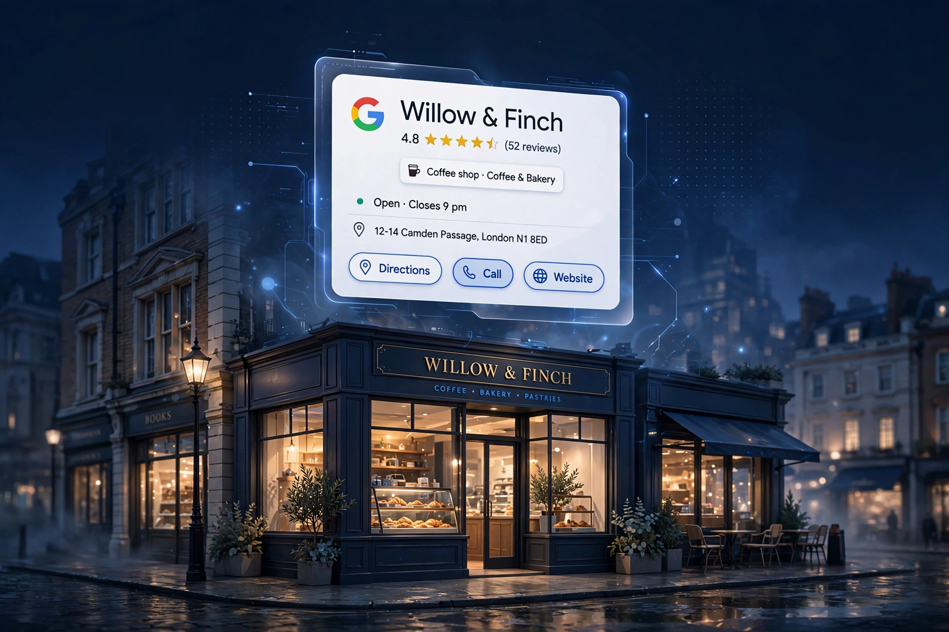
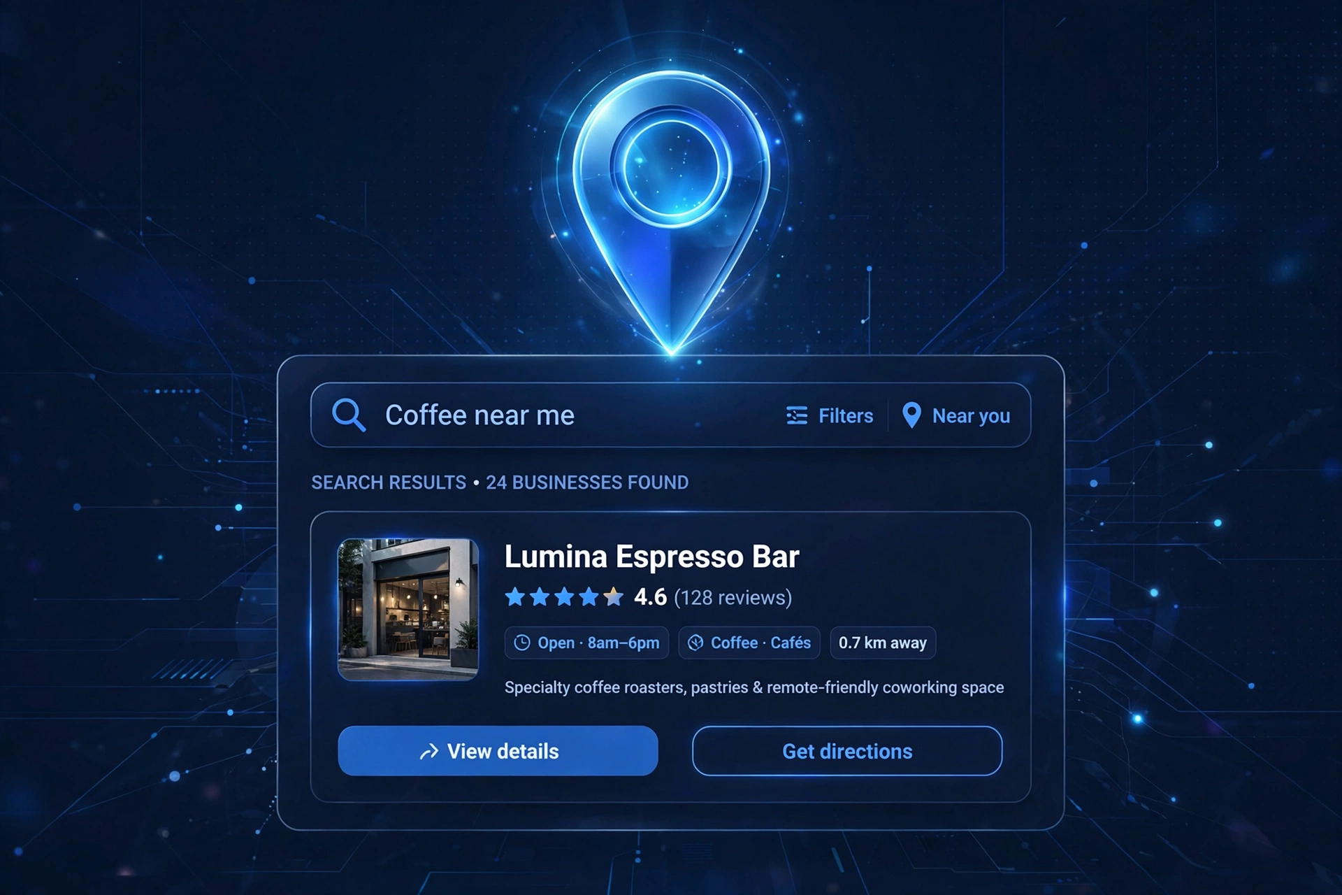
When a customer near you searches “plumber near me” or “café in Leeds”, what appears first is not a list of websites — it is a map with three businesses on it. That little map pack comes straight from Google Business Profile (the free listing Google gives every business), and it is the single most valuable piece of online real estate a small business can own.
It costs nothing, takes an afternoon to set up, and it puts you in front of customers who are ready to buy today. This guide walks you through setting up and optimising your Google Business Profile in 2026, step by step.
What Is Google Business Profile?
Google Business Profile is the free business listing that appears on Google Search and Google Maps. It shows your business name, address, phone number, opening hours, reviews, photos and posts — everything a customer needs to decide to contact you.
Think of it as your shop window on Google. When someone searches for what you do in your area, your profile is what they see before they ever visit your website. For many small businesses, the profile gets more views than the website itself — which is exactly why it deserves proper attention.
Your profile is what customers see before your website.
“It is the single most valuable piece of online real estate a small business can own — and it costs nothing.”
1
Claim or Create Your Listing
Start at google.com/business and sign in with a Google account you control — ideally one the business owns, not a personal Gmail that you might lose access to one day.
Search for your business name. If it already exists (Google often creates listings automatically from public information), click “Claim this business”. If nothing appears, click “Add your business” and create it from scratch.
Enter your details carefully:
Business name — use your real trading name, exactly as it appears on your shopfront, invoices and website. Do not stuff keywords into the name (Google penalises this).
Category — pick the one primary category that describes what you do best. A bakery should choose “Bakery”, not “Café”, even if it serves coffee.
Address — enter your real address. If you visit customers at their homes (plumbers, cleaners, tutors) rather than receiving them at yours, you can hide the address and set a service area instead.
Phone and website — add both. A missing phone number or website link is a small thing that quietly costs enquiries.
2
Verify Ownership
Google will not show your listing properly until you prove you own the business. Verification methods vary, but the most common in 2026 are:
Video verification — recording a short video showing your business location, signage and equipment. This is now the default for most UK businesses.
Postcard by mail — Google posts a card with a code to your business address, usually arriving within a week or two.
Phone or email verification — available for some business types.
However Google asks you to verify, do it promptly. An unverified listing sits in limbo: half-visible, easy to distrust.
3
Complete Every Section
A half-empty profile looks like a half-open shop. Google favours complete listings, and customers trust them more. Fill in everything:
Opening hours, including special hours for bank holidays. Wrong hours are one of the most common customer complaints — and one of the easiest to fix.
Services — list what you actually offer, with brief descriptions.
Products — if you sell things, add your main products with photos and prices.
Attributes — details like “wheelchair accessible”, “women-led”, or “outdoor seating”. These help you appear in filtered searches.
Business description — a short, plain-language paragraph about who you are and what you do. Write it for customers, not for algorithms.
Booking links — if you take appointments, link your booking system directly.
Check this section every few months. Businesses change — hours shift, services get added — and a stale profile quietly misleads people.
4
Add Photos and Posts
Businesses with photos get noticeably more engagement than those without. And it does not need to be a professional shoot:
The outside of your premises (so people recognise you when they arrive).
The inside — clean, welcoming, real.
You and your team at work — customers buy from people, not logos.
Your products or finished work — the proof of what you do.
Aim for a mix that is honest and up to date. Blurry photos are worse than none, but a modern phone in decent light is all you need.
Google also lets you publish posts to your profile — short updates about offers, events or news. Think of it as a mini social media feed that appears on your listing. A post every week or two keeps the profile looking alive, and it is free advertising in front of people already searching for you.
5
Ask for Reviews — and Reply to Them
Reviews are the engine of Google Business Profile. They influence your ranking in the map results, and they are the first thing customers read before calling you. Businesses do not get reviews by accident; they get them by asking.
Ask happy customers directly, right after a good job — in person, by text, or with a printed card at the till.
Make it easy: Google gives you a short review link you can share.
Never buy reviews, and never write fake ones. Google removes them and can penalise the listing.
Then reply to every review. Thank the positive ones by name. For negative ones, stay calm, stay polite, and offer to make it right — your reply is read by every future customer who sees the review. A business that handles criticism gracefully earns more trust than one with a suspiciously perfect score.
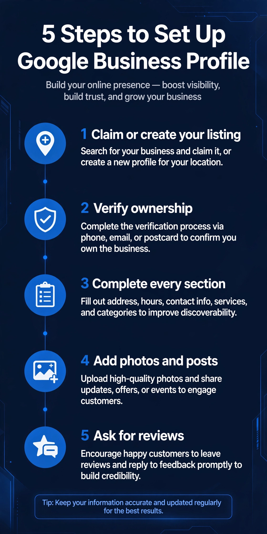
The five steps at a glance — save it, then work through them one by one.
The Mistakes That Hold Small Businesses Back
Most poorly performing profiles fail for the same handful of reasons:
01The wrong primary category
A small choice with a big effect on which searches you appear in.
02Keyword-stuffed business names
“Best Plumbers London Cheap Emergency” will get the listing suspended, not ranked.
03Duplicate listings
Old or accidental second listings split your reviews and confuse customers. Find them and remove or merge them.
04Ignoring the Q&A section
Anyone can ask questions on your profile; answer them yourself before a stranger does it wrong.
05Setting it up once and forgetting it
Hours drift, photos go stale, and competitors who keep theirs fresh pull ahead.
How Google Business Profile Works With Your Website
Your profile and your website are not competitors — they are a team. The profile catches the local search and gives customers the essentials instantly; the website does the deeper selling, shows your full story, and captures the enquiry.
Make sure the two agree with each other: the same business name, the same address, the same phone number, everywhere. This consistency (marketers call it “NAP consistency”) helps Google trust that you are who you say you are.
Keep your NAP consistent
Name, Address and Phone number — identical on your profile, your website and every directory. That consistency is what makes Google trust your business.
If you do not have a website yet, the profile alone can still win you customers. But every serious competitor eventually has both, and the profile links straight to your site — a direct pipeline from “customer searching” to “customer enquiring”.
Frequently Asked Questions
Is Google Business Profile really free?
Yes. Creating, verifying and managing a listing costs nothing. Google may offer paid advertising around it, but the profile itself is free.
How long does verification take?
Video verification can be done in a day. Postcard verification depends on the post — usually one to two weeks in the UK. Plan for it rather than waiting until you need the listing.
Can I manage the profile if I have multiple branches?
Yes — you can add multiple locations under one account, each with its own listing, hours and reviews.
What if someone else claimed my business?
You can request ownership of the listing through Google’s claim process. Google will contact the current owner, and if they do not respond, ownership transfers to you.
Do I still need it if most of my work comes from word of mouth?
Word of mouth still ends at Google. When someone recommends you, the first thing the new customer does is search your name — and what they find there decides whether they call.
Your Next Step
A complete, verified, well-reviewed Google Business Profile is the highest-return free marketing a small business can do. It takes an afternoon to set up and a few minutes a week to maintain — and it puts you on the map, literally, in front of customers who are searching right now.
If you would like a professional eye on how your business appears on Google — your profile, your website, and everything in between — book a free 15-minute website audit with Altus Web Solutions.
Is Your Website Too Hard to Read? (And How to Fix It in Minutes)
Nobody ever left a website because the words were too easy to understand. They leave because the words were too hard — a wall of long sentences, jargon and corporate filler that takes effort to decode. Visitors don’t make that effort. They go back to Google and click your competitor.
The good news: readability is measurable, and fixing it is one of the cheapest wins in marketing. Here’s what “reading age” means, six rules for writing plain English, and a free tool that scores your copy in seconds.
What reading age actually means
Reading age is the age of the reader who would understand your text comfortably. It’s derived from the Flesch-Kincaid formula, which looks at two things: how long your sentences are, and how long your words are. Short sentences plus short words equals a low reading age. Long sentences plus long words equals a high one.
A reading age of 9 doesn’t mean your writing is childish — it means almost every adult can read it quickly and without effort. That’s exactly what you want on a website, where people skim. A reading age of 16 means you’re writing for university graduates. Fine for an academic journal; fatal for a plumber’s homepage.
Most small-business websites we see land somewhere between 13 and 17 without their owners realising. They didn’t choose that level. It just happened, one long sentence at a time.
Why hard-to-read copy costs you customers
1. People don’t read — they scan
On a screen, visitors skim headings and first lines, hunting for the bit that answers their question. Dense paragraphs with 30-word sentences are invisible to skimmers. Short sentences and plain words survive the scan.
2. Confusion kills trust
If a visitor has to re-read a sentence to understand your services, a small doubt creeps in: “If their website is this hard to follow, what will working with them be like?” Clear writing signals a business that’s easy to deal with.
3. Mobile makes it worse
So many website visits happen on phones — small screens, on the move, full of distractions. Copy that was merely heavy on a desktop becomes unreadable on a phone. Short is not just nice — it’s necessary.
4. Google prefers clear answers
Search engines are built to match questions with clear answers. Pages that explain things plainly tend to earn the featured snippets and the clicks. Readable copy is good SEO without any tricks.
Six rules for plain English that still sounds professional
1. Keep sentences under 20 words
This single change does more than everything else combined. If a sentence runs past 20 words, split it. Your readers will thank you by staying on the page.
2. Swap long words for short ones
“Utilise” → “use”. “Approximately” → “about”. “Facilitate” → “help”. “In order to” → “to”. Nobody ever chose a supplier because their website said “utilise”. Short words aren’t dumbing down — they’re speeding up.
3. Kill the filler phrases
“Due to the fact that” is just “because” wearing a suit. “At this point in time” is “now”. “A large number of” is “many”. Cut them and your sentences get shorter without losing a single fact.
4. Use the active voice
“The project was completed by our team” hides who did what. “We completed the project” says it straight. Active voice is shorter, clearer and more confident — exactly how you want your business to sound.
5. One idea per sentence
When a sentence tries to do three jobs — explain the service, mention the guarantee and add the call to action — it does none of them well. Give each idea its own sentence. White space is free.
6. Read it out loud
The oldest editing trick there is. If you stumble reading a sentence aloud, your visitors will stumble reading it silently. Rewrite until it flows.
Rules are easier to follow when you can see the result. Our free checker gives your text a reading age, a Flesch score out of 100, five more readability formulas, and a concrete fix list: your longest sentences flagged, long words paired with simpler swaps, wordy phrases tightened, and passive voice highlighted. Paste your homepage copy, check the score, rewrite, and check again. Aim for reading age 9–12 for a general audience. No account, nothing to install, and your text never leaves your browser.
FAQs
What reading age should my website be?
For a general audience, 9–12. That’s the level most adults read quickly and comfortably on a screen. Specialist audiences — engineers, medics, lawyers — can handle higher, but make it a deliberate choice for the right pages, not an accident across the whole site.
Will plain English make my business look less expert?
No. Explaining things simply is the mark of someone who truly understands their subject. Jargon is often a hiding place; clarity is a selling point. Your expertise shows in what you know, not in how many syllables you use.
Are readability scores exact?
They’re well-established estimates, not exact science. The formulas behind them have been used by publishers and governments for decades. Treat them as a compass: the direction (simpler, shorter, clearer) matters more than any single number.
How is this different from a grammar checker?
Grammar checkers fix mistakes. A readability checker fixes difficulty — sentences that are grammatically perfect but exhausting to read. You need both, but difficulty is the one most businesses never check.
Your website’s words are doing a sales job every hour of every day. Make them easy to read and they sell harder. Run your homepage through the free checker today — and fix the reading age before your competitors’ plain English does the persuading for you.
Want your whole website’s copy reviewed properly? Book a free 15-minute consultation — we’ll find everything that’s holding your words back and tell you exactly how to fix it, in plain English.
AI Enquiry Forms: Turning Contact Forms into Bookings
Every small business website has one: the contact form. A name field, an email field, a box for the message, and a “Send” button. Most of them quietly fail at their one job — turning a curious visitor into a booked conversation.
They find your site at 9pm, fill in the form, and get… silence. The reply lands two days later, by which time they’ve spoken to three competitors who answered faster. The form didn’t lose that customer — the wait did.
An AI enquiry form fixes this. It’s a contact form with a brain: it understands what the visitor wants, asks the right follow-up questions, answers common ones, and books a meeting or passes the enquiry on — instantly, around the clock. This guide explains what AI enquiry forms are, how they work, and whether your business needs one.
What is an AI enquiry form?
A standard contact form is a digital suggestion box. The visitor types something in, and it sits there until a human reads it. An AI enquiry form is different: it’s a conversation.
Instead of a blank message box, the visitor gets guided questions — “What service are you interested in?”, “When would you like to talk?” — and the form adapts to their answers. Behind the scenes, an AI reads the responses, qualifies the enquiry (is this a real opportunity, and how urgent is it?), answers straightforward questions from your FAQ and service pages, and takes the next step: booking a slot in your calendar, sending the right follow-up email, or flagging a hot lead to your phone immediately.
The result: instead of “thanks, we’ll reply soon”, the visitor gets “great — I’ve booked you in for a 15-minute call on Thursday at 10:30. Here’s what we’ll cover.” That is the difference between a website that collects enquiries and one that converts them.
Why traditional contact forms lose business
Contact forms fail in predictable ways, and most business owners have felt the consequences:
Speed kills — or saves. When someone enquires, they are interested now. The longer the gap between their enquiry and your response, the colder that lead gets. If you can’t answer in minutes, a competitor who can will take the conversation. An AI form replies in seconds, every time, including nights and weekends.
Blank message boxes invite weak enquiries. “Please tell us about your project” gets you one-word messages like “website” or “quote please”. You then burn two or three email rounds just to learn what the person actually wants. A guided AI form asks the useful questions up front, so enquiries arrive qualified and structured.
Nobody wants to wait to book. Many visitors would rather pick a time themselves than exchange emails about availability. A form that offers live calendar booking removes the friction entirely — the meeting is confirmed before they’ve even left your site.
Enquiries fall through the cracks. Forms that send plain emails get buried in inboxes, caught by spam filters, or forgotten on busy days. An AI form logs every enquiry, routes it properly, and chases the follow-up so nothing goes quiet.
How an AI enquiry form actually works
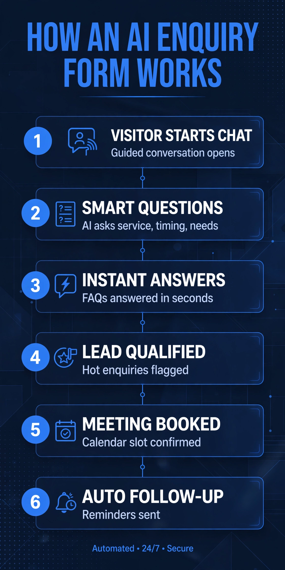
Strip away the hype and the process is straightforward:
1. The visitor starts a conversation. Instead of a static form, they see a friendly, guided exchange — often on the same contact page. It feels like texting a business, not filling in paperwork.
2. The AI asks smart questions. Based on your services, it asks what the visitor needs, their timeline, and a rough budget range. The questions adapt: a school gets different follow-ups than a plumber.
3. It answers on the spot. “Do you work with businesses in Manchester?” “How long does a website take to build?” The AI answers from your real content, so visitors get answers immediately instead of waiting for you.
4. It qualifies the lead. The AI scores the enquiry: what they want, how soon, and whether they’re a fit for your services. Time-wasters get polite, useful answers; real opportunities get fast-tracked.
5. It books or routes. Hot enquiries can book straight into your calendar. Others get a structured summary emailed to you — with all the answers collected — plus an instant confirmation to the visitor.
6. It follows up. If the visitor drops off halfway, the form can send a gentle nudge. If they book, it sends reminders. The follow-up happens automatically instead of living on your to-do list.
What the AI can and can’t do
Let’s be honest about the limits, because they’re important.
It can: answer common questions from your website content, collect structured enquiry details, qualify leads by service and urgency, book meetings into a real calendar, send instant confirmations and reminders, and route urgent or complex enquiries to a human with full context.
It can’t: replace human judgement on pricing or project scope, handle genuinely novel or sensitive situations, or build the trust a real conversation builds. That’s why a good AI enquiry form always offers an easy escape route: “Would you prefer to speak to a person?” should be one tap away.
Think of it as your best receptionist: tireless, instant, and thorough — but smart enough to hand over to you when it matters.
Who benefits most from an AI enquiry form?
They pay for themselves fastest where enquiries are frequent, time-sensitive, or arrive outside working hours:
Trades (plumbers, electricians, builders): enquiries come in evenings and weekends; instant qualification and booking wins the job.
Agencies and studios: the form pre-qualifies budget and project type, so discovery calls start with substance instead of small talk.
Schools and education providers: parents ask the same questions repeatedly — the AI answers them at midnight without tying up the office.
Clinics and practices: appointment booking straight from the form, with reminders that cut no-shows.
E-commerce businesses: answering “where’s my order?” and “do you deliver to…?” before they ever reach support.
If your current contact form mostly generates back-and-forth emails, you’re the ideal candidate.
What to look for (and what to avoid)
Not every “AI form” is equal. A few things matter:
It must be trained on YOUR business. A generic chatbot that answers from the open internet will invent details about your services. The AI should be grounded in your actual pages, pricing framework, and policies. If a provider can’t explain how they keep the AI honest, walk away.
Human handoff must be one step. Some visitors will want a person. Make sure the form offers that clearly and passes the full conversation to whoever picks it up — nobody should have to repeat themselves.
It should respect your calendar. Booking into a real calendar (with your availability, buffer times, and time zones handled) is what turns an enquiry into a booked meeting. A form that just says “we’ll call you” hasn’t finished the job.
Keep the design minimal and on-brand. The form lives on your website, so it should look like it belongs there — your colours, your tone of voice, your level of polish. A jarring third-party widget undermines trust.
Watch the data. Enquiries contain personal information. Your provider should be clear about where data is stored, who can see it, and how it complies with UK GDPR. If they can’t answer that plainly, it’s a red flag.
How much does it cost?
Honest answer: it depends on the scope. A simple AI enquiry form on an existing website is a modest addition; a fully custom one — integrated with your calendar, CRM, and follow-up sequences — is a bigger project. We work on a firm fixed price once we understand your project: after a free consultation, you’ll know exactly what the form costs, what it does, and when it goes live. No hourly meters, no surprise invoices.
Most small businesses sit in our lower project levels for this work — defined scope, delivered in weeks, not months. The real question: what are unanswered enquiries costing you right now?
Getting started: what we’d need from you
The setup is mostly on us. From you, we’d need:
Your services (we can pull this from your site)
The questions you get asked over and over (your personal FAQ)
Your availability for bookings, and where they should land (your calendar)
What makes an enquiry “hot” for your business — and what a polite decline looks like
Your tone of voice: friendly and chatty, or professional and direct?
Most businesses can answer that in a single 15-minute conversation — exactly what our free consultation is for.
Frequently asked questions
Will the AI give wrong answers about my business?
Not if it’s set up properly. The AI is grounded in your real content — your pages, services, and FAQs — so it answers from what you actually say, not what it guesses. And anything it’s unsure about gets routed to you.
Will visitors find it creepy or annoying?
Only if it’s done badly. A well-built form feels like helpful texting, not a robot interrogation. Visitors can always reach a human, and the whole exchange takes less time than a traditional form.
Does it work on mobile?
It has to — most of your visitors are on phones. The conversation format actually suits mobile better than long forms, which people abandon halfway.
What happens to my existing contact form?
It gets replaced or upgraded. Your old enquiries and workflows stay intact; the AI form simply takes over the front end and feeds the same inbox or CRM you’re already using.
Can it handle multiple languages?
Yes. If your customers speak Urdu, Polish, or Arabic, the AI can converse in their language while reporting back to you in English.
The bottom line
Your contact form is often the first real conversation a customer has with your business. A blank box and a two-day wait says “we’ll get to you eventually.” An AI enquiry form says “we’re here, we understand what you need, and here’s your booking.” In 2026, that difference wins business.
If your enquiries are slow to get answered, thin on detail, or arriving at midnight with nobody home, it’s time for an upgrade.
Ready to turn your contact form into a booking machine?Book a free 15-minute website consultation — we’ll audit your current enquiry flow and show you exactly what an AI enquiry form would do for your business.
Altus Web Solutions builds AI-powered websites for UK small businesses — from smart enquiry forms to full AI receptionists. Firm fixed pricing, agreed before we start.
How to Brief a Web Designer: What to Prepare Before You Call
Most website projects don’t go wrong because of bad design. They go wrong because of a bad brief — or no brief at all.
If you walk into your first call with a web designer and say “I need a website, something modern, how much?”, you’re handing them a blank sheet and asking them to read your mind. What you get back will be a guess. Sometimes it’s a lucky guess. Usually it’s an expensive one.
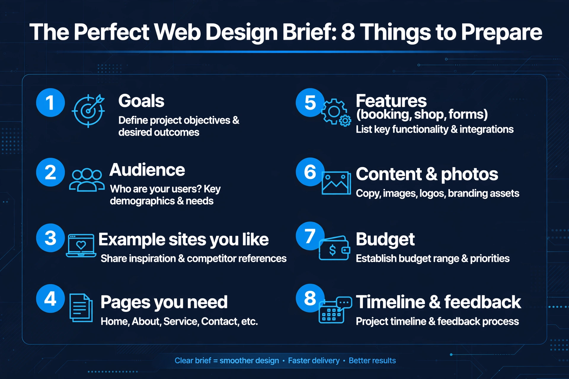
The good news: a proper brief doesn’t take long to prepare, and it pays for itself many times over. It gets you an accurate quote, a design that actually fits your business, and a project that finishes on time. Here’s exactly what to prepare before you pick up the phone.
1. Start with your goals — not your favourite colours
The single most important line in any brief is the answer to this question: what do you want the website to do for your business?
“Look professional” isn’t a goal. “Get more enquiries from local customers” is a goal. “Take online bookings so I stop playing phone tag” is a goal. “Sell my products online without me managing stock emails” is a goal.
A designer who knows your goal makes different decisions about everything — the layout, the buttons, the pages, even the words. Write down your one main goal, plus one or two secondary ones. If you genuinely don’t know, say so on the call; a good designer will help you work it out. But arriving with even a rough answer puts you miles ahead.
2. Describe your customers
Who is the website actually for? “Everyone” is the wrong answer — a website for everyone ends up speaking to no one.
Think about your best customers. Are they mostly local, or do they come from all over? Are they price-sensitive or quality-focused? Are they browsing on their phones at 10pm, or sitting at an office desk?
Jot down a short profile: who they are, what they worry about, and what would make them pick you over a competitor. This tells the designer how the site should look, what tone the words should take, and which pages matter most.
3. Collect examples — of what you like AND what you don’t
This is the fastest way to get aligned on style. Browse the websites of businesses you admire — they don’t have to be in your industry. When you find one you like, note down what you like about it: the clean layout, the big photos, the way the booking button is always visible.
Equally useful: examples of sites that put you off, with one line on why. “This one feels cluttered.” “This one’s text is too small to read on my phone.” This saves enormous amounts of back-and-forth later, because “modern” means something different to every person on earth.
Aim for three to five likes and two or three dislikes. Links are enough — you don’t need screenshots.
4. List the pages and features you need
You don’t need a full sitemap, but a rough page list helps the designer quote accurately — and stops the “oh, we also need a shop” moment halfway through the build.
A typical small-business site might need:
Home — the front door, with a clear headline and call to action
About — who you are and why customers should trust you
Services — what you offer, ideally one page per service
Testimonials or reviews — proof you do good work
Contact — with a simple form, your phone number and opening hours
Blog or news — optional, but great for search engines
Then the features: do you need online booking? A contact form that goes to your email? A photo gallery? A shop with checkout? An FAQ section? A map? List everything you can think of, even if you’re unsure — the designer can tell you what’s sensible and what’s overkill.
5. Sort out your content and photos — early
This is where most projects stall. The design gets finished, and then everyone waits three weeks for the “about us” paragraph and decent photos.
You don’t need final copy before the first call, but know who will write it: you, or the designer (many offer copywriting as an add-on). And be honest about your photos. If all you have are dim phone pictures from 2019, say so — the designer can plan around it, suggest a photographer, or use well-chosen stock imagery.
The rule of thumb: if the website launches in March, your words and pictures need to be ready in February, not “sometime soon”.
6. Set a budget — and say it out loud
Nobody likes talking about money first, but your budget is the single biggest factor in what the designer recommends. A £500 site, a £2,500 site and a £10,000 site are three completely different projects, and guessing which one you want wastes everyone’s time.
You don’t need to know what websites cost — that’s the designer’s job to tell you. What helps is a range: “we’re hoping to spend around X” or “we absolutely can’t go above Y”. A trustworthy designer will tell you honestly what your budget buys, and what it doesn’t.
Our approach at Altus is a firm fixed price once we understand your project — no hourly billing surprises, no creeping costs. We work in levels, from a solid starter site up to fully custom builds with AI features like chat and booking automation. Knowing your budget lets us put you in the right level from day one.
7. Agree on how you’ll work together
Before the project starts, get clear answers to a few practical questions:
How long will it take? A typical small-business site takes a few weeks; anything much longer or much shorter deserves an explanation.
How do I give feedback? One round of changes or unlimited tweaks? Clarity here prevents painful arguments later.
Who is my contact? One named person beats a faceless support queue.
What happens after launch? Who updates the site, fixes things, and keeps it secure? Ask about maintenance upfront — a website isn’t a one-off purchase, it’s a living thing.
Write down the answers. A short email summary after the call is worth its weight in gold.
8. The thing most people forget: access and logins
On launch day, nothing is more frustrating than discovering nobody knows who owns the domain name. Before the project starts, track down:
Your domain name login (the company you bought it from — e.g. GoDaddy, 123 Reg, Namecheap)
Access to your current hosting, if you have a site already
Any existing email or booking systems the site needs to connect to
If you’ve lost them, recover them now — it can take days, and it always happens at the worst moment.
What a good designer will ask YOU
Pay attention to the questions on that first call. A good designer asks about your business, your customers, and your goals. They ask what’s worked and what hasn’t. They may challenge your assumptions — that’s a good sign.
Be cautious if the conversation jumps straight to colours, fonts and prices without a word about your business. A website is a business tool first and a design object second. Anyone who skips the business part is decorating, not designing.
Red flags to watch for
No questions about your goals. See above.
A quote with no breakdown. You should know what you’re paying for.
“Unlimited everything” promises. Usually means nothing is actually defined.
No contract or terms. Even a one-page agreement protects both sides.
Pressure to decide today. A good designer is busy enough not to need that.
Frequently asked questions
Do I need a written brief, or is a chat enough? A chat is a fine start, but get the key points in writing afterwards — goals, pages, budget, timeline. Memory is unreliable; email isn’t.
What if I don’t know what I want? That’s completely normal, and honestly telling the designer is far better than pretending. A good designer will guide you — but “I don’t know yet” is a starting point, not a brief.
How detailed should the brief be? One to two pages is plenty for most small businesses. Enough to be clear, short enough that someone actually reads it.
Should I get multiple quotes? Yes — two or three. Compare them on what they include and how well the designer understood your goals, not just the price. The cheapest quote for the wrong website is the most expensive option.
Ready to brief us?
If you’ve worked through the list above, you’re already ahead of most people who pick up the phone. And if you haven’t — no problem. Book a free 15-minute consultation and we’ll walk through it together, no jargon, no obligation.
Book your free website consultation — we’ll audit your current site (or your plans for a new one) and give you honest advice on the right next step.
What Is a Meta Description? (And How to Write One Google Won’t Rewrite)
Search for anything on Google and every result has the same anatomy: a blue title, a green-ish web address, and two lines of grey text underneath. Those two lines are the meta description — and for most small business websites, they’re an afterthought. The page got written, the title got written, and the description was left to chance.
That chance costs clicks. The meta description is your 155-character sales pitch, shown to every person who finds you on Google, before they’ve seen a single pixel of your website. Here’s what it is, how to write one that works, and a free tool that checks yours in seconds.
What a meta description actually is
A meta description is a short summary of a page, written in the page’s HTML code, that Google may show underneath the page title in search results. “May” is doing heavy lifting there — Google treats your description as a suggestion, not an order. If it likes yours, it shows it. If it doesn’t, it writes its own from your page text.
It is not a ranking factor. Google has said so plainly, more than once. Stuffing keywords into it won’t move you up the results. What it does is decide what happens after someone finds you: a clear, relevant description gets the click, and clicks are the entire point of ranking in the first place.
Think of it this way: the title wins the ranking, the description wins the click.
Where it shows up (and where it doesn’t)
The meta description appears in Google’s search results under your page title — the snippet. It also frequently becomes the preview text when someone shares your page on social media or in a message (though social platforms prefer their own Open Graph tags when those exist).
It does not appear on your page itself. Visitors never see it there. Its entire audience is people who haven’t clicked yet — which is exactly why it matters more than most businesses realise.
How to write one that gets clicks — 5 rules
1. Keep it 120–155 characters
Google shows roughly the first 155 characters — and it cuts by pixel width, not character count. A description full of wide letters (W, M, G) gets cut earlier than one full of narrow ones (i, l, t). The practical rule: aim for 120–155 characters, and put the important words in the first 120 so they survive even an aggressive cut.
2. Put the keyword near the front
When the searcher’s words appear in your description, Google bolds them — and bolded words draw the eye. Include the main keyword or phrase for the page, naturally, near the beginning. “Naturally” matters: “Web design Leeds | web design services | best web design” reads like spam and invites a rewrite.
3. Say what the page gives, then say what to do
The best descriptions do two jobs in two beats: what this page is (“Affordable web design for Leeds small businesses — fixed prices, no jargon.”) and what to do next (“Book a free consultation today.”). That second beat — the call to action — is the most commonly missing ingredient. Tell the searcher the next step: book, shop, call, download, get a quote.
4. Write it like a human, for a human
No all-caps. No exclamation-mark confetti. No copying the page title into the description field (surprisingly common — it wastes the space and reads terribly). One page, one unique description, in the same voice as the page itself.
5. Every important page gets its own
Google rewrites descriptions it considers unhelpful, and “identical on forty pages” tops that list. You don’t need to write one for every page on a 500-page site — but every page that matters for search (homepage, services, key landing pages) deserves its own unique description.
Why Google rewrites descriptions (and how to stop it)
Google rewrites your description when it thinks it can do better — typically when yours is missing, very short, stuffed with keywords, or duplicated across pages. It then assembles something from your page content, which may be accurate but is rarely persuasive.
You can’t force Google to use yours. You can only make yours so clearly good — unique, relevant, the right length, matching the search intent — that Google has no reason to replace it. That’s the whole game.
Rules are easier to follow when you can see the result. Our free checker scores your description out of 100, shows you a live desktop and mobile Google preview (cut exactly where Google would cut it), and flags the specific fixes — length, keyword placement, call to action, shouting, title duplication. Paste a URL and it reads the live page; or paste draft text you’re working on. No account, nothing to install.
FAQs
Does the meta description help me rank higher?
Not directly — it’s not a ranking factor. But a better description means a higher click-through rate, which means more visitors from the rankings you already have. For most small businesses, that’s the cheaper win.
What happens if I don’t write one?
Google writes one for you from your page text. Sometimes it’s fine; often it’s a random slice of a paragraph that says nothing persuasive. If any page matters to your business, write its description yourself.
Should each page have a different meta description?
Yes — at minimum, every page you want found on Google. Duplicate descriptions across pages are one of the main triggers for Google rewriting them.
Can a meta description be too long?
Yes. Anything past ~155 characters (or ~920 pixels wide) gets cut off mid-sentence in the results, which looks unfinished. Keep it tight and front-load the important words.
The meta description is the smallest copywriting job on your website and one of the highest-leverage: two lines, thirty seconds each, shown to every searcher who finds you. Check yours today — and fix the cut-off ones before your competitors’ snippets do the persuading for you.
Want your whole site’s SEO reviewed properly? Book a free 15-minute consultation → — we’ll find everything that’s holding your rankings back and tell you exactly how to fix it, in plain English.
Your website is the hardest-working member of your team. It never sleeps, never takes a holiday, and greets every potential customer who finds you online. Yet most business owners can tell you the last time they serviced their car, but not the last time anyone properly checked their website.
A website audit is that check. It is a systematic, honest examination of how your site is performing — not just how it looks, but how fast it loads, how it behaves on a phone, whether Google can find it, whether visitors trust it, and whether it turns any of them into enquiries. In 2026, when customers research everything online before they pick up the phone, running your business on an unchecked website is like running your shop with the lights off.
Here is what a website audit actually is, what it checks, and why every business — from a one-person trade to a growing company — needs one.
What is a website audit?
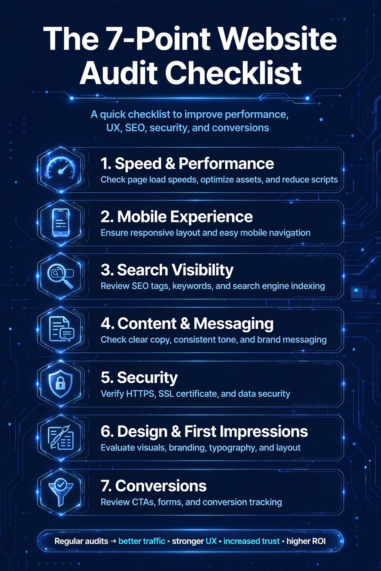
A website audit is a structured health check for your site. Instead of guessing why the phone is quiet or why visitors leave without enquiring, an audit measures what is really happening: page by page, across speed, mobile experience, search visibility, content, security, design and conversions.
It is worth saying what an audit is not. It is not a quick glance at your homepage and a verdict of “looks fine”. It is not a scare tactic designed to sell you a rebuild. A proper audit is evidence-based: it runs real tests, lists real problems, and — crucially — prioritises them, so you know which fixes will make the biggest difference and which can wait.
The 7 things a proper website audit checks
1. Speed and performance
Nobody waits for a slow website. Visitors on a phone, on a train, on patchy wifi — which describes a large share of your traffic — will simply leave if your pages drag. An audit measures how long your pages actually take to load on real devices and connections, and finds what is slowing them down: oversized images, too many plugins, cheap hosting, or code that was fine five years ago and is not fine now.
Speed is not just about patience. Google uses page experience as a ranking signal, so a slow site is also a less visible site.
2. Mobile experience
Most of your visitors are on a phone. An audit checks your site the way they see it: Are buttons big enough to tap? Is the text readable without pinching and zooming? Does the menu work? Is the enquiry form usable on a small screen? A site that was designed on a desktop and never properly tested on mobile is quietly turning away the majority of its visitors.
3. Search visibility (SEO)
If Google cannot find, understand or trust your pages, customers cannot either. An SEO audit checks the technical foundations — whether your pages are indexed, whether titles and descriptions say what they should, whether headings are structured properly, whether images have alt text, and whether broken links or duplicate content are undermining you. It also looks at the basics Google expects every business site to get right: a sitemap, secure HTTPS, and a Google Business Profile that matches your site.
You do not need to become an SEO expert. But you do need to know whether your site has the foundations in place, because everything else you do to get found builds on them.
4. Content and messaging
This is the part most audits skip and most websites fail. An audit reads your site the way a first-time visitor does and asks hard questions: Does the homepage say what you do within five seconds? Is it obvious who you serve? Does the copy answer the questions customers actually ask — how much, how long, do you cover my area? Is the content thin, outdated, or full of jargon?
Outdated content quietly damages trust. A “latest news” section that stops in 2023, or service pages describing things you no longer offer — all of it tells a visitor the same thing: nobody is minding this shop.
5. Security
A hacked or insecure website does not just embarrass you — it actively drives customers away. Browsers now warn visitors loudly when a site is not secure, and a single “not secure” warning next to your address bar can end a visit before it starts. An audit checks that your site runs over HTTPS with a valid certificate, that software and plugins are up to date, and that there are no known vulnerabilities or malware warnings attached to your domain.
For any business that takes enquiries or payments online, this is non-negotiable.
6. Design and first impressions
Visitors judge your business by your website in seconds, and they compare it — consciously or not — with your competitors’. An audit looks at your site with fresh eyes: does it look current or a decade old? Is the branding consistent? Are images sharp or pixelated? Does the layout guide the eye, or does everything compete for attention?
This is not about fashion. It is about credibility. A dated, cluttered site tells a visitor your business might be dated and cluttered too — whether or not that is true.
7. Conversions: turning visitors into enquiries
This is the check that matters most, and the one almost nobody does. Traffic is vanity; enquiries are sanity. An audit follows the path a visitor takes and asks: Is there a clear call to action on every page? Does the contact form ask for the minimum, or does it interrogate people? Is your phone number visible on mobile? What happens after someone submits the form — do they get a confirmation, a timeframe, a human response?
Many businesses spend money driving traffic to a website that was never set up to convert it. An audit finds the leaks in that bucket before you pour more water in.
The warning signs your website needs an audit now
You do not need to wait for a scheduled review if any of these sound familiar:
Enquiries have dropped but you cannot point to why. The site is slow, especially on your own phone. It looks dated next to competitors — you feel slightly embarrassed sending people to it. You have changed the business (new services, new prices, new area) but the site still describes the old one. You are spending on marketing — ads, social, flyers — and the website is where all of it lands. Customers keep asking questions the website should answer — opening hours, prices, whether you cover their area. You have never had one. If no one has ever audited the site since it launched, it needs one. Full stop.
Any one of these is reason enough. Two or more, and the audit is overdue.
Free tools vs a professional audit
You can — and should — run some checks yourself. Google’s PageSpeed Insights will grade your speed for free. Google Search Console (also free) will tell you whether Google can crawl your site and flag the obvious errors. Browsing your own site on your phone, honestly, as a customer would, is more revealing than most owners expect.
But free tools have limits. They report symptoms, not causes. They will tell you a page is slow without telling you which of the fourteen things slowing it down to fix first. They will flag SEO issues without telling you which ones are costing you customers and which are noise. And they will never tell you that your messaging is confusing, your offer is unclear, or your call to action is invisible — because those are judgement calls, and judgement is what a professional audit adds.
The honest answer: start with the free checks, but get a professional audit at least once — it gives you the prioritised list that turns “our website needs work” into an actual plan.
How often should you audit your website?
For most small businesses, a full audit once a year is the right rhythm — and a lighter check every quarter. Audit sooner if you redesign the site, change what you sell, notice a drop in enquiries, or start spending seriously on marketing. A website is not a brochure you print once; it is a living asset, and it needs the same periodic attention as everything else in the business.
What happens after the audit
An audit is only useful if it leads to action. A good audit report does three things: it lists every issue found, it ranks them by impact (what is costing you customers versus what is merely untidy), and it gives you a clear order of work.
Some fixes are quick — updating content, compressing images, fixing broken links. Others are structural — a slow theme, a confusing layout, a site that was never built to convert. Knowing which is which is the whole point: it stops you spending money on the wrong things.
At Altus, every project starts from this kind of honest assessment. We scope work to a firm fixed price once we understand your project — no hourly meters running, no surprises — across four levels depending on what your business actually needs, from essential fixes to a full rebuild. The audit tells us which level fits, so you never pay for more than the problem requires.
Frequently asked questions
How long does a website audit take?
A thorough audit of a typical small-business site takes a few days of proper work — running the tests, reading the site as a customer would, and writing up prioritised findings. Anyone promising a complete audit in ten minutes is running an automated scan, not an audit.
How much does a website audit cost?
It varies. Many agencies, including Altus, offer a free initial audit — a genuine health check, not a sales call in disguise — because it is the fastest way to show you what is actually wrong. Deeper technical audits are usually quoted as a fixed price once the size of the site is understood.
Can I audit my own website?
You can make a start: check your speed with free tools, browse the site on your phone, and read every page as a first-time visitor. What you cannot easily do is see your own blind spots — the confusing navigation you have learned to live with, the jargon you no longer notice, the technical issues buried under the surface. That is what an outside pair of eyes is for.
Will an audit hurt my search rankings?
No — an audit changes nothing on your site. It only reports. The fixes that follow an audit are what improve rankings, and a good audit prioritises the safe, high-impact ones first.
Get your free website audit
Your website might be fine. But “might be” is an expensive way to run a business. A free 15-minute audit will tell you exactly where your site stands — what is working, what is costing you enquiries, and what to fix first.
Big Images, Slow Website? How to Shrink Images Properly (Free Tool)
Open your website on your phone — not on wifi, on mobile data — and watch it load. If the text appears and then the images stagger in one by one, you have the most common speed problem on the small-business web: images that are far heavier than they need to be.
It happens innocently. Someone uploads a photo straight from a phone, or a screenshot saved as a PNG, or a “quick” banner at full camera resolution. Each one is megabytes your visitor has to download. The good news: shrinking images is the easiest, highest-impact speed fix there is — and it takes about thirty seconds. Here’s how to do it properly.
Why images are the biggest reason your site feels slow
A modern web page is mostly images by weight. Text, buttons and styling are tiny; the photos are the cargo. So when a page feels sluggish, the images are the first suspect — especially on mobile, where visitors may be on patchy data and every megabyte is felt.
Slow pages don’t just annoy. Visitors give a page a few seconds before they start doubting it — and a business site that loads in pieces looks unfinished, even when the design is beautiful. Search engines notice loading speed too, which means heavy images quietly cost you both visitors and rankings.
The three ways to shrink an image
Every image diet comes down to three levers. Understand them once and you’ll never upload a heavy image again.
1. Quality — the slider that matters most
JPEG and WebP images are “lossy”: they can be re-encoded at lower quality settings, throwing away detail your eye can’t see. Around 80% quality looks identical to the original on a screen but is dramatically smaller. Below 60% you’ll start noticing softness — fine for thumbnails, risky for hero images. The trick is finding the lowest quality that still looks perfect, which is why a live preview matters.
2. Resize — the biggest single saving
A phone photo is often 4000 pixels wide. Your website probably displays it at 800–1600 pixels. Those extra pixels are pure weight: downloaded by every visitor, displayed by none of them. Resizing to the display size is frequently the largest saving of all — bigger than any quality tweak. Rule of thumb: blog images 1024 px, hero banners 1600 px, thumbnails 640 px.
3. Format — pick the right container
JPEG is the workhorse for photos: small and universal. PNG is lossless, which keeps logos and graphics crisp but makes photos much heavier — never use PNG for a photograph if you can avoid it. WebP is the modern best-of-both: visibly identical quality at much smaller sizes, supported by every current browser. When in doubt for photos: WebP first, JPEG second.
Four mistakes that make images heavy
Uploading phone photos untouched. Straight off the camera: 4000 px wide, several megabytes. Always resize and compress before uploading — never after.
PNGs where JPEGs belong. Screenshots and graphics are fine as PNG; photographs are not. A photo saved as PNG can be several times heavier than the same photo as a JPEG.
One giant image for every screen. That 1600 px hero doesn’t need to also serve as the 300 px thumbnail. Resize copies for their actual jobs.
Compressing the only original. Always keep your full-size original safe. Compress copies for the web — if you compress the original itself, the lost quality is gone forever.
Shrink yours in 4 steps
You could install software, learn its export dialogue, and do this one image at a time. Or use our free tool — no account, no upload, no watermark:
Step 1 — Drop in your image
Drag and drop a JPEG, PNG or WebP (up to 25 MB) onto the tool. You’ll see its name, size and dimensions instantly.
Step 2 — Pick a format and quality
Keep the original format or switch — the tool gives honest advice, like warning you that PNG output barely shrinks (it’s lossless). Drag the quality slider; 80% is the sweet spot for most photos.
Step 3 — Resize in one click
Pick the size that matches where the image will live: 1024 for blogs, 1600 for heroes, 640 for thumbnails. Or keep the original size and let quality do the work.
Step 4 — Check the truth, then download
The tool shows original vs compressed size, the exact percentage saved, and side-by-side previews — and it warns you honestly if the result somehow grew. Download the smaller file, upload it to your site, done.
At sensible settings (around 80% quality), no. The compression removes detail the human eye doesn’t register on screens. Check the side-by-side preview — if you can’t see a difference, neither can your visitors.
Should I convert all my PNGs to WebP?
For photographs and large graphics, usually yes — the savings are dramatic. For tiny logos and icons where every pixel matters, keeping PNG is fine. Convert the heavy ones first; they’re where the wins are.
Do I need to compress images my web designer already uploaded?
Worth checking. Many sites we see carry full-resolution originals the designer never touched. Run your heaviest pages through the tool and re-upload — it’s the cheapest speed win available.
Is it safe to compress images in a browser tool?
With ours, yes — your images never leave your device, because the compression happens inside your own browser. (Not all online tools work this way; many upload your images to their servers first.)
Image weight is the quiet tax on your website — paid by every visitor, on every page, in loading seconds. The fix takes half a minute per image and costs nothing. Shrink the heavy ones today, and your whole site feels faster tomorrow.
You’re paying for clicks. Ads, social posts, email campaigns — they all cost time or money, and they all end in the same place: someone landing on your page. If that page doesn’t persuade them to take the next step, every penny spent getting them there is wasted.
A landing page has one job. Whether it’s “book a call”, “request a quote” or “buy now”, the entire page exists to move a visitor toward that single action. Most business landing pages fail not because the design is ugly, but because they try to do everything at once and end up doing nothing well.
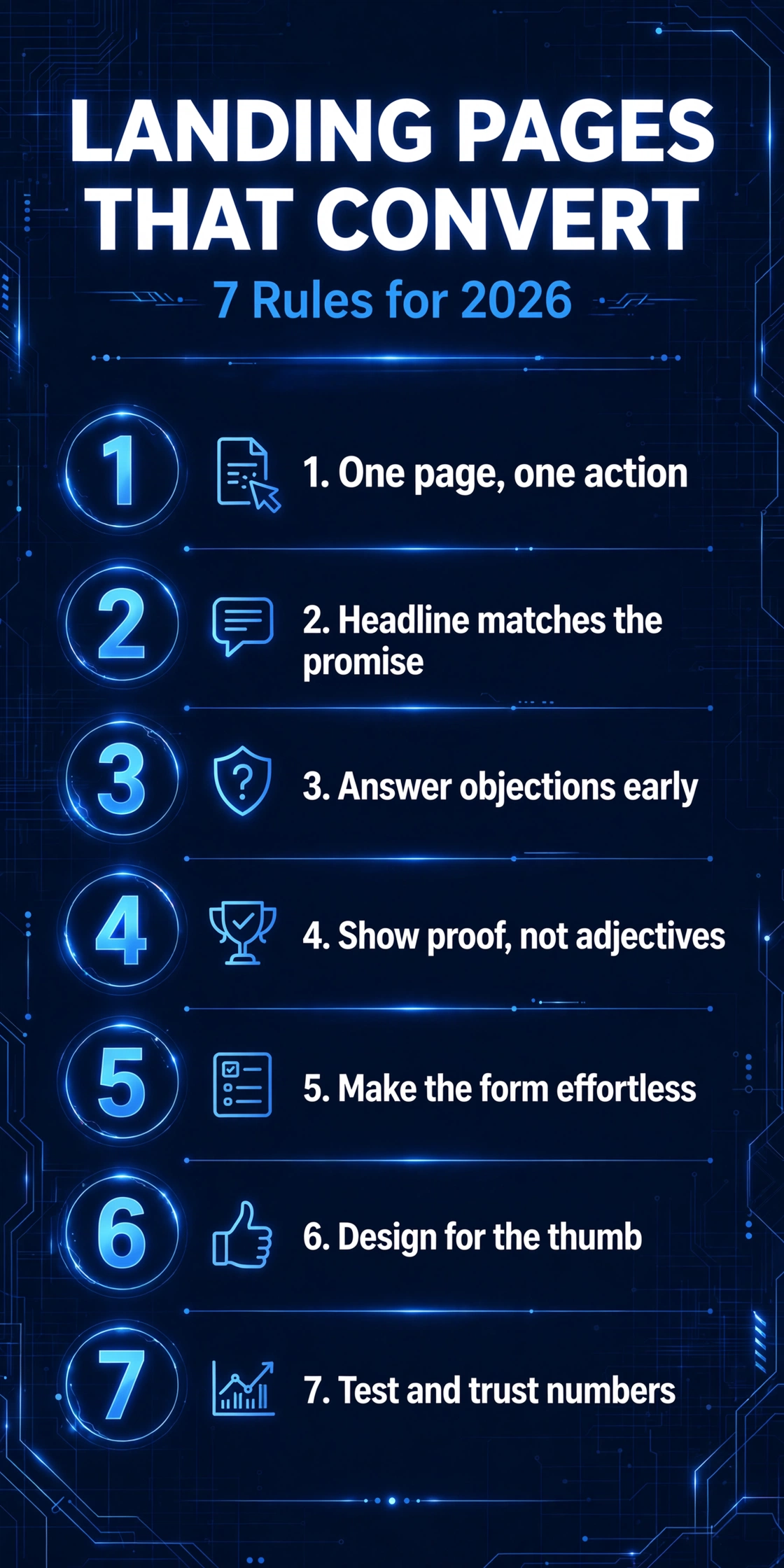
These seven rules are what separate landing pages that convert from landing pages that just sit there. They work for trades businesses, schools, service companies, and online shops alike — because they’re about how people actually make decisions, not about design trends.
Rule 1: One page, one action
The most common landing page mistake is the crowded page. The headline says “Book your free consultation”, but the navigation offers six other pages, there’s a newsletter signup in the sidebar, three different services are promoted, and the footer asks visitors to follow on social media. The visitor arrived with one question — “should I take this step?” — and left with twelve options and no answer.
Decide the single action your page exists to drive, then remove everything that doesn’t serve it. Strip out the main navigation or trim it to the bare minimum. Delete the newsletter box, the social feed, the “you might also like” links. Every link on a landing page is an exit door — lock the doors.
Don’t ask visitors to “call, email, or message us” — pick the one channel you respond to fastest and make it the star. One clear action, repeated confidently down the page, beats a menu of options every time.
Rule 2: The headline must match the promise
Think about how your visitor arrived. They clicked an ad or a link that promised something: “Free website audit”, “Get a quote in 24 hours”, “Book your school’s demo”. The first three seconds on your page are spent checking one thing — did I land in the right place?
If your headline says something different from the ad or link they clicked, trust breaks instantly. They don’t read further to work it out. They hit back.
Be specific. “We help businesses grow” is not a headline — it’s wallpaper. Specificity is what makes a visitor think “this is for me”.
Rule 3: Answer the objection before they feel it
Every visitor arrives with a quiet list of doubts: Will this work for a business like mine? Is it going to cost a fortune? How long will it take? If those doubts go unanswered, they don’t ask — they leave.
The fix is to handle objections in the order visitors feel them. Early on the page, prove relevance (“Built for UK trades businesses”). Further down, address risk: guarantees, no obligation, what happens if they’re not happy. Near the form, remove the last friction: “Takes 60 seconds”, “We’ll reply within one working day”, “No spam, ever”.
You don’t need to guess what your visitors worry about. Look at the questions your calls and emails are full of — “how much?”, “how long?”, “do you work with businesses like mine?” Answer each one on the page before the visitor has to ask.
Rule 4: Show proof, not adjectives
“We’re the best.” “Cutting-edge.” “Market-leading.” Every business says it, which means it persuades no one. Adjectives are free and visitors know it.
Proof costs you something — and that’s exactly why it works. Real proof takes several forms:
Numbers with context. “Helped 120+ UK businesses launch new websites” beats “experienced team”. Specific numbers beat round ones.
Real reviews. Genuine Google or Trustpilot reviews with names and businesses attached. Anonymous testimonials (“J. from London”) persuade no one.
Before and after. For web design, the old site next to the new one. For trades, the problem and the fix. Transformation is the most persuasive proof there is.
Your face and your story. A photo of the actual person or team and a line about who you are — it makes the page human and the promise believable.
Place proof early — not buried at the bottom. By the time a visitor scrolls halfway, they’ve already half-decided. Proof near the top tips them over.
Rule 5: Make the form feel effortless
The form is where conversions die. Every field you add is a small tax on the visitor’s patience, and the total adds up fast. The rule is simple: ask for the minimum you need to start the conversation — usually a name, an email or phone number, and one line about what they need. Nothing else.
A few specifics that matter more than people think:
Label every field clearly. Placeholder text that vanishes when you click is not a label. Visitors forget what the field was for, and on mobile it’s genuinely confusing.
One column, top to bottom. Multi-column forms look tidy and convert worse. Eyes read down, not across.
Make the button say what happens. “Submit” is the worst button text in existence. “Get my free audit”, “Book my consultation” — the button should complete the sentence “I want to…”.
Reassure next to the button. One line — “We’ll reply within one working day. No spam, ever.” — can lift completions more than any redesign.
And when the form is submitted, don’t leave the visitor staring at a dead page. A clear thank-you message saying what happens next (“We’ll call you tomorrow morning”) turns a conversion into the start of a relationship.
Rule 6: Design for the thumb, not the desktop
More than half of your visitors will read your landing page on a phone, often while doing something else. Yet most landing pages are designed on a big monitor, approved on a big monitor, and only checked on a phone as an afterthought.
Design for the phone first:
The headline, one proof point, and the call-to-action button must fit on the first screen without scrolling. If a mobile visitor has to hunt for what to do, you’ve lost them.
Buttons must be big and thumb-friendly. A tiny text link buried in a paragraph is not a call to action.
Kill the pop-ups. A pop-up on a landing page is an interruption on top of an interruption. On mobile it’s infuriating.
Speed is a conversion feature. Every extra second of load time costs you visitors. Compress images, drop the fancy animations, and test the page on a real phone over mobile data — not just on office wifi.
If your landing page only looks good on a desktop, it only converts on a desktop. And that’s the smaller half of your traffic.
Rule 7: Test one thing at a time, then trust the numbers
Here’s the uncomfortable truth: nobody can tell you with certainty which headline will convert better for your business. Not us, not a guru on YouTube, not your most opinionated friend. The only honest answer comes from testing.
The good news is that testing doesn’t have to be complicated. Change one thing — the headline, the button text, the main image, the form length — run both versions for a couple of weeks (or until a few hundred visitors have seen each), and keep the winner. Then test the next thing.
Three things that make testing work:
Only test pages with enough traffic. If your page gets 20 visitors a week, you won’t learn anything for months. Test the pages that matter most first.
Change one thing at a time. Redesigning everything and seeing conversions go up tells you nothing about what worked — you’ll never be able to repeat it.
Decide in advance what winning looks like. “More form submissions” is a goal. “The new headline wins if it gets 15% more submissions over 300 visitors” is a test.
Most small businesses never test at all, which means even basic testing puts you ahead. You don’t need expensive software to start — you need discipline and patience.
Putting it together: the anatomy of a page that converts
Apply all seven rules and your landing page looks like this, top to bottom: a headline matching the promise that brought the visitor, with the call to action visible on the first screen; proof near the top, not buried; the offer explained in plain terms; objections handled and risk reversed; a short form with a button that says what happens; and a final call to action for the scrollers who made it to the bottom.
Nothing on that list is expensive or technically difficult. It’s all about discipline: one page, one action, one clear promise, proven honestly.
Frequently asked questions
How long should a landing page be?
Long enough to answer every objection, short enough that no section feels like filler. For a simple offer (a free audit, a quote request), a single screen plus a short scroll is often enough. For higher-commitment actions, visitors need more proof and detail — the page earns its length.
Should a landing page have navigation?
Ideally, no. Every navigation link is an exit door. If you must include links, keep them minimal and in the footer, never competing with your call to action.
What’s a good conversion rate for a landing page?
It varies by industry and offer, but as a rough guide: 2–5% is typical for a general small-business landing page, while a tightly targeted page with a strong offer can reach 10% or more. Rather than chasing a benchmark, focus on improving your own number month over month.
Do I need a separate landing page for each ad campaign?
Yes, whenever the promise differs. If one ad offers a free audit and another offers web design services, those visitors have different expectations and need different pages. Sending both to your homepage is the most common — and most wasteful — landing page mistake.
The bottom line
Landing pages don’t convert because they’re beautiful. They convert because they’re focused: one action, one promise, proven honestly, with every objection answered and every bit of friction removed. Get the fundamentals right and the design almost takes care of itself.
If your website is getting traffic but not enquiries, the landing page is the first place to look — and the fastest thing to fix. We offer a free 15-minute website audit where we’ll look at your key pages and tell you exactly what’s holding them back.
A customer stands in their kitchen and asks their phone, “Where’s the best web design company near me?” A smart speaker answers with a single name. An AI chatbot drafts an answer and links to two websites. No one typed anything. No one scrolled through ten blue links.
That is how more and more customers find businesses in 2026 — through voice assistants and AI-powered search. The question for your business is simple: when an AI assistant answers your customer’s question, is it quoting your website or your competitor’s?
This guide explains what’s actually changing, and the six practical things you can do about it.
How people really use voice search
Typed searches are short: “web design london”. Voice searches are sentences: “Who’s the best web design company in London for small businesses?” People talk to their devices the way they’d talk to a person — full questions, with words like who, what, where, when and how.
That difference matters because most business websites are written for typed searches. They target short keyphrases and expect visitors to do the reading. Voice search flips it around: the device does the reading, and it reads from one source — the page it trusts most to answer the question directly.
So the websites winning voice searches have one thing in common: they answer questions clearly, in natural language, near the top of the page.
Why AI search changes the rules even more
Voice assistants were the warm-up. The bigger shift is AI search: instead of a list of links, search engines and chatbots now give a single summarised answer, built from a handful of trusted sources. If your website isn’t one of those sources, you never appear — not even as a link.
Here’s the uncomfortable part: AI answers are trained on content that’s clear, structured and easy to quote. Vague marketing copy gets skipped. “We deliver cutting-edge digital solutions” means nothing to an AI — and increasingly, nothing to customers either. Pages that state plain facts, in plain sentences, get cited.
The good news? You don’t need new technology to fix this. You need clearer content. And that’s entirely within your control.
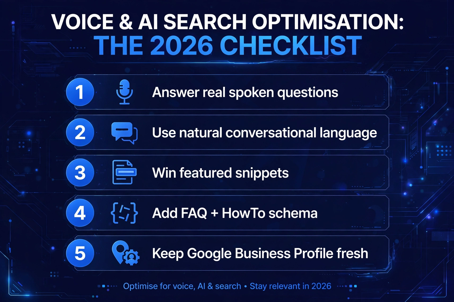
Step 1: Answer the questions your customers actually ask
Start with the questions people ask before they buy from you. Not the ones you wish they’d ask — the real ones, the ones your phone calls and emails are full of. “How much does it cost?” “How long will it take?” “Do you work with businesses like mine?”
Write each question out, exactly the way a customer would say it out loud. Then answer it on your website — directly, honestly, and in the first few sentences. Long, winding introductions bury the answer. An AI looking for a quotable answer will take the page that gives it first.
A dedicated FAQ page is worth its weight in gold here. One question per heading, one clear answer beneath it. It reads naturally to humans and it’s exactly the structure voice assistants love.
Step 2: Write the way people talk
Read your homepage out loud. Does it sound like a person explaining your business — or like a brochure from 2009? Most business websites fail this test badly.
Conversational copy wins voice search for a simple reason: the assistant is looking for an answer that sounds right when read aloud. Short sentences. Everyday words. Answers that start with the point instead of circling it for three paragraphs.
Try this: for every important question on your site, write a two-to-three sentence answer first — under fifty words — then expand with detail underneath. That opening block is your “spoken answer”. It works for humans too: busy visitors skim the short version and read on only if they’re interested.
Step 3: Win the featured snippet
When you search Google for a question, you’ll often see an answer box above the results — a paragraph, a list, or a table pulled from a single page. That’s the featured snippet, and it’s the single biggest building block of voice search answers. When someone asks their phone your question, the snippet is very often what gets read out.
Winning snippets isn’t mysterious. Structure your content the way snippets look:
Definitions: a one-sentence definition of a term, right after the heading. (“An AI receptionist is a virtual assistant that answers your business calls, takes messages, and books appointments around the clock.”)
Lists: numbered steps and bullet points. Google loves pulling these into answer boxes.
Tables: comparisons in table form — features, prices ranges, options — are snippet gold.
Direct answers: the question as a heading (H2 or H3), the answer in the first sentence beneath it.
You don’t have to win every snippet. But every question page on your site should be built to win its snippet.
Step 4: Add structured data — FAQ and HowTo schema
Schema is a way of labelling your content so search engines understand it precisely. Two types matter most for voice and AI search:
FAQ schema marks up your question-and-answer pairs. It makes your FAQ page eligible for rich results and helps AI systems extract clean Q&A.
HowTo schema marks up step-by-step instructions. If your business teaches anything — how to choose, how to prepare, how to maintain — this is how AI assistants find and quote your steps.
If your site runs on WordPress, plugins like Yoast SEO and Rank Math can add FAQ schema with a couple of clicks — no coding needed. The important thing is that the structured data matches the visible content on the page. Marking up answers that don’t exist on the page is a quick way to lose trust.
Step 5: Keep your Google Business Profile razor sharp
A huge share of voice searches are local: “Where’s the nearest…”, “Who’s open now?”, “Find me a…”. These answers come almost entirely from Google Business Profiles, not from websites.
If your profile is incomplete, outdated, or missing reviews, you’re invisible to every one of those searches. Check the basics: correct opening hours, accurate categories, a real description, current photos, and a steady flow of genuine reviews that you actually reply to. It’s free, it takes an afternoon to get right, and for local businesses it’s one of the highest-impact things on this entire list.
Step 6: Don’t forget the basics — speed, mobile and HTTPS
Voice and AI assistants favour websites that are fast, mobile-friendly and secure. That part hasn’t changed — it’s just more unforgiving now, because there’s no list of ten results for a slow site to hide in. One answer gets chosen. Make sure it’s yours.
If your site takes more than a few seconds to load on a phone, or throws security warnings, fix that before anything else on this list. Everything else is decoration on a broken foundation.
Frequently asked questions
Is voice search really important for small businesses?
For local businesses, yes — enormously. “Near me” and “best … near me” queries are overwhelmingly spoken, and they come from people ready to buy. If your competitors are optimised for voice and you aren’t, you’re handing them ready-made customers.
Do I need to rebuild my website for AI search?
No. AI search optimisation is mostly about content clarity and structure — clearer answers, better headings, schema markup, an up-to-date Google Business Profile. Most of it can be done on your existing site.
What’s the difference between SEO and AI search optimisation?
Traditional SEO helps you rank in a list of results. AI search optimisation helps you become the answer — the source an AI quotes. The foundations overlap (good content, technical health), but the emphasis shifts: quotable clarity beats keyword density.
How long does it take to see results?
Content changes can start showing in search results within weeks, but becoming a trusted, cited source is a longer game — think months of consistent, clear content. Anyone promising overnight results is selling you something.
Can Altus help with this?
Yes — it’s exactly what we do. We audit your site against voice and AI search, rewrite the pages that matter, add the structured data, and sort your Google Business Profile. Start with a free 15-minute website audit and we’ll show you exactly where you stand.
Is your website ready for voice and AI search? When a customer asks their phone for what you do, make sure the answer is you. Book a free 15-minute website audit and we’ll show you exactly what’s working, what’s missing, and what to fix first — no jargon, no obligation.
QR Codes for Small Business: Where to Put Them (Free Maker)
Walk down any UK high street and you’ll see them: little black-and-white squares on shop windows, café counters, menus, vans and estate agent boards. QR codes went from novelty to infrastructure in a few short years — and for a small business, they’re one of the cheapest marketing tools ever invented. Free to make, free to print, and they turn a passing glance into a website visit.
But most business QR codes are an afterthought: tiny, grey, linking to a homepage nobody asked for. Here’s how to use them properly — where to put them, what to link, and the mistakes that make them unscannable — plus a free tool that makes them right.
Why QR codes work for small businesses
A QR code removes exactly one thing: typing. Nobody types a web address from a van driving past. Nobody carefully copies a Wi-Fi password from a framed card without sighing. Every character a customer has to type is a customer you lose — a scan replaces all of it with one camera-point.
They cost nothing beyond the printing you were doing anyway, they work on every modern phone with no app to install, and unlike a web address on a flyer, you can point them at exactly the right page: not “our website”, but the booking page, the menu, the review form.
The placements that actually earn their keep
The shop window and the front door
Your window works 24 hours a day; your staff don’t. A QR code on the glass linking to opening hours, the menu or the booking page turns foot traffic after closing time into enquiries by morning. Make it big — people scan windows from the pavement, not from centimetres away.
The till and the counter
This is prime real estate: a customer standing still, phone in hand, with thirty seconds to kill. Link it to your Google review page and ask for the review while the experience is fresh — or to a loyalty sign-up, or today’s special. One scan beats a printed “please review us” card every time.
Menus, tables and waiting rooms
Cafés and salons already know this one, but go beyond the menu: a table QR that joins guests to the Wi-Fi (no more password spelling), or a waiting-room code linking to your price list and booking page. Boredom plus a phone is an opportunity.
The van and the uniform
A van is a moving billboard seen from metres away — so the code must be large (think A4 at minimum) and link somewhere worth visiting: the quote form, not the homepage. Same logic for workwear and site boards on trades jobs.
Business cards and flyers
A card has room for one link; a QR code carries six. Put the code on the back linking to your booking page or portfolio, and keep the front clean. On flyers, link to the specific offer on the flyer — never make someone hunt for it on your homepage.
Receipts and packaging
The sale is done; the relationship isn’t. A receipt QR linking to reordering, a how-to video or review page catches customers at peak goodwill. E-commerce parcels: a card in the box linking to setup guides cuts support messages.
What to link (hint: rarely the homepage)
The golden rule: link to the page that completes the thought. Window code → opening hours or booking. Van code → quote form. Till code → review page. Packaging → setup guide. Every extra click between scan and action loses people, so the destination page must also work flawlessly on a phone — a QR code that opens a desktop-only page is worse than no code at all.
Two more rules. First, link to pages you plan to keep: a printed QR code can’t be edited later, so never point one at a limited-time offer page you’ll delete. Second, keep the destination short and simple — if the page needs scrolling and pinching to use, fix the page before printing the code.
Five mistakes that make QR codes unscannable
Too small. The number-one killer. Minimum 2 × 2 cm for hand-held items, much larger for anything scanned at distance. Print a test and scan it yourself before the full run.
Weak contrast. Grey on white, brand pastels, or a “stylish” inverted code — phones read dark-on-light. If your colours are close together, it won’t scan reliably.
No quiet zone. The plain border around the code isn’t decoration; scanners need it to find the edges. Don’t crop it, don’t fill it with pattern.
Blurry or damaged prints. Low-resolution images, stretched aspect ratios and scratched signage all break scanning. Use a high-resolution PNG or SVG, never a screenshot of a screenshot.
Linking to the wrong place. A code that opens your homepage when the flyer promised 20% off teaches customers not to scan your codes again.
Make yours in 4 steps
You could wrestle with a random generator that watermarks everything and holds your downloads hostage. Or use ours — free, no account, no watermark:
Step 1 — Pick what it should do
Choose Website, Text, Email, Phone, SMS or Wi-Fi. For a till code, that’s your review page link; for a café counter, the Wi-Fi tab with your network name and password.
Step 2 — Fill in the boxes
Type the link or details — the preview updates live as you type, so you see exactly what you’re getting. The tool adds the https:// if you forget it.
Step 3 — Style it (carefully)
Set your brand colours, but watch the contrast warning: if the tool flags your combination, listen to it — it’s telling you phones will struggle. Keep the quiet zone on.
Step 4 — Download and test
Grab the PNG (up to 2048 px for print) or the SVG for your designer. Then the non-negotiable step: print one, scan it with your own phone, in real light, at real distance. Only then print five hundred.
No — a QR code is just your information encoded as a pattern. There’s no subscription or renewal. It keeps working as long as the page or detail it contains still exists, which is why you should link to permanent pages.
Do customers need a special app to scan?
Not any more. Every iPhone and Android phone from the last several years scans QR codes with its built-in camera — point, tap the notification, done.
Can I put my logo in the middle of a QR code?
You can, but it damages readability — the logo covers data modules. If you must, use the highest error-correction setting and test-scan extensively. For most small businesses, a clean code next to your logo works better than a compromised code under it.
How do I track scans?
The code itself doesn’t count scans. The practical workaround: point it at a dedicated landing page (e.g. yoursite.co.uk/scan-offer) and watch that page’s visits in your analytics — you’ll know exactly how the code is performing.
A good QR code is a tiny bridge between your physical presence and your website — and it costs you nothing but a few minutes. Make one that actually scans, put it where customers already stand still, and point it somewhere worth visiting.