The Anatomy of a High-Converting Homepage
Above the fold is your make-or-break moment. Here's how the best-performing websites turn visitors into enquiries and customers.
Your homepage has less than 5 seconds to answer three critical questions:
✅ Who do you help?
✅ Why should visitors trust you?
If visitors can't find those answers immediately, they'll leave—and often end up on a competitor's website. A homepage isn't just a design asset. It's one of the most important sales tools your business owns.
Grab attention instantly.
Explain the benefit.
Build credibility.
Drive enquiries.
10 Essential Elements of a High-Converting Homepage
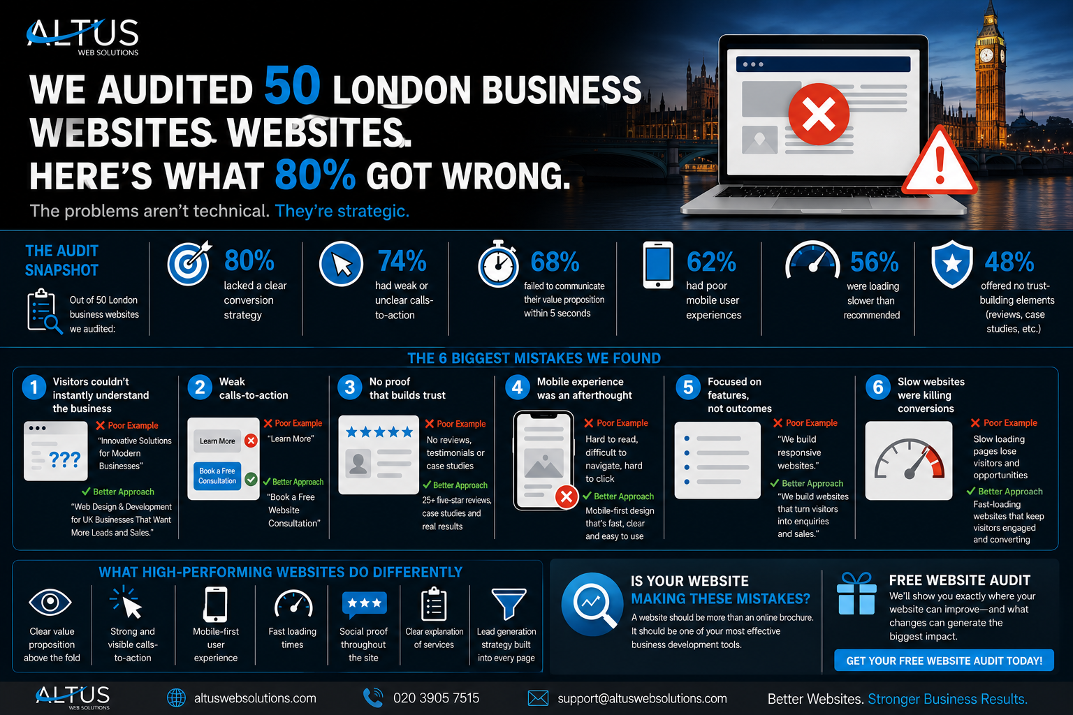
1. Clear Headline
Your headline should immediately explain what you do and who you help.
Example: Websites Designed to Generate More Leads for UK Businesses.
2. Supporting Statement
Reinforce your value proposition with a concise explanation of the results you deliver.
3. Strong CTA
Give visitors a clear next step such as booking a consultation or requesting a quote.
4. Trust Signals
Reviews, testimonials, certifications and case studies help reduce uncertainty.
5. Visual Hierarchy
Guide visitors naturally through your content using spacing, contrast and typography.
6. Mobile Experience
Most visitors now arrive via mobile. Optimise every section for smaller screens.
7. Fast Loading Speed
Every second matters. Faster websites generally generate more conversions.
8. Benefits Over Features
Focus on outcomes and results instead of technical specifications.
9. Social Proof
Show real client success stories, reviews and measurable outcomes.
10. Conversion Footer
Include contact information, navigation links and a final call to action.
The Perfect Homepage Formula
Common Homepage Mistakes
- Generic headlines that don't explain your value.
- No clear call-to-action.
- Slow loading pages.
- Poor mobile usability.
- Too much text above the fold.
- Lack of reviews or social proof.
- Feature-focused messaging instead of benefits.
Final Thoughts
A homepage shouldn't exist to impress visitors—it should exist to convert them. Every section should have a purpose: build trust, communicate value, reduce friction and encourage action.
If your homepage fails to explain who you help, what you do and why visitors should choose you within seconds, you're likely losing leads every day.
The good news? Small improvements can create significant increases in enquiries, conversions and revenue.
Is Your Homepage Costing You Leads?
We help businesses create websites that don't just look great—they generate enquiries and drive growth.
Request a Free Website Review